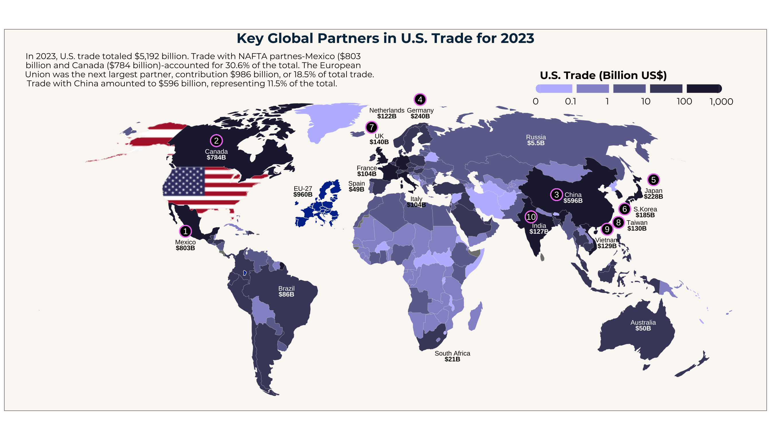
Project archive
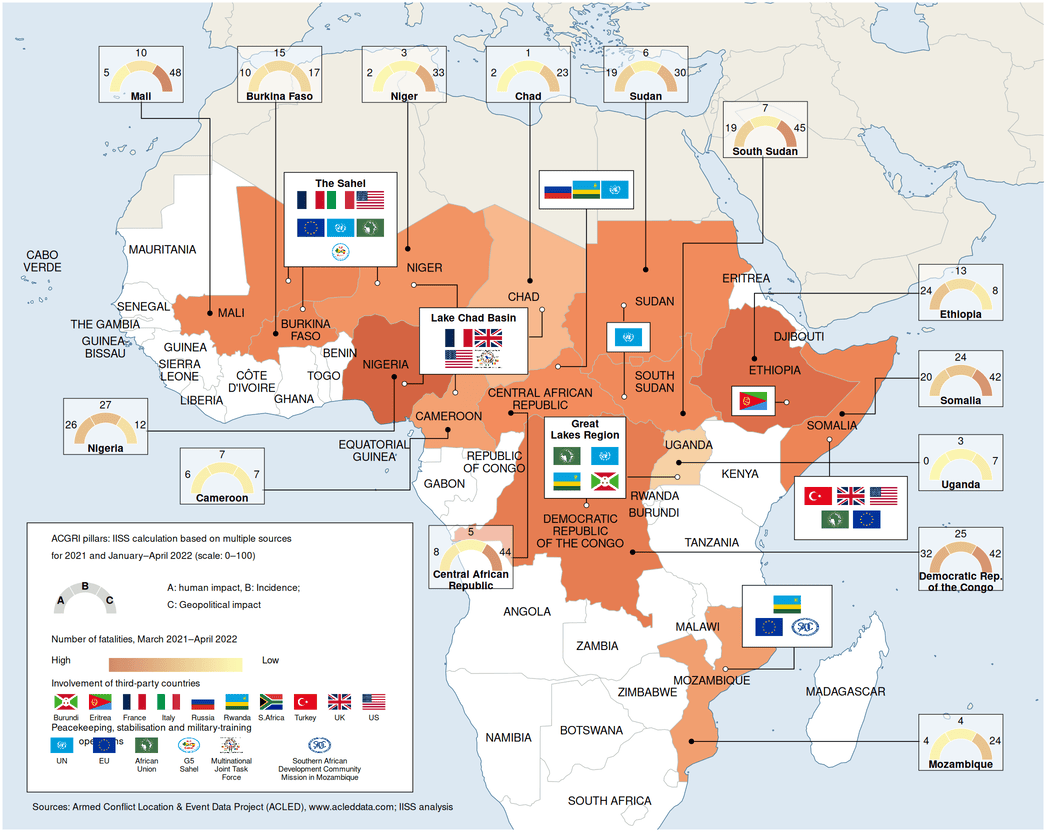
Conflict in Sub-Suharan Africa
A series of graphs representing conflict in Sub-Suharan Africa from 2021 - 2022
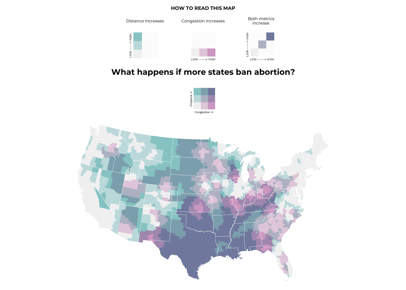
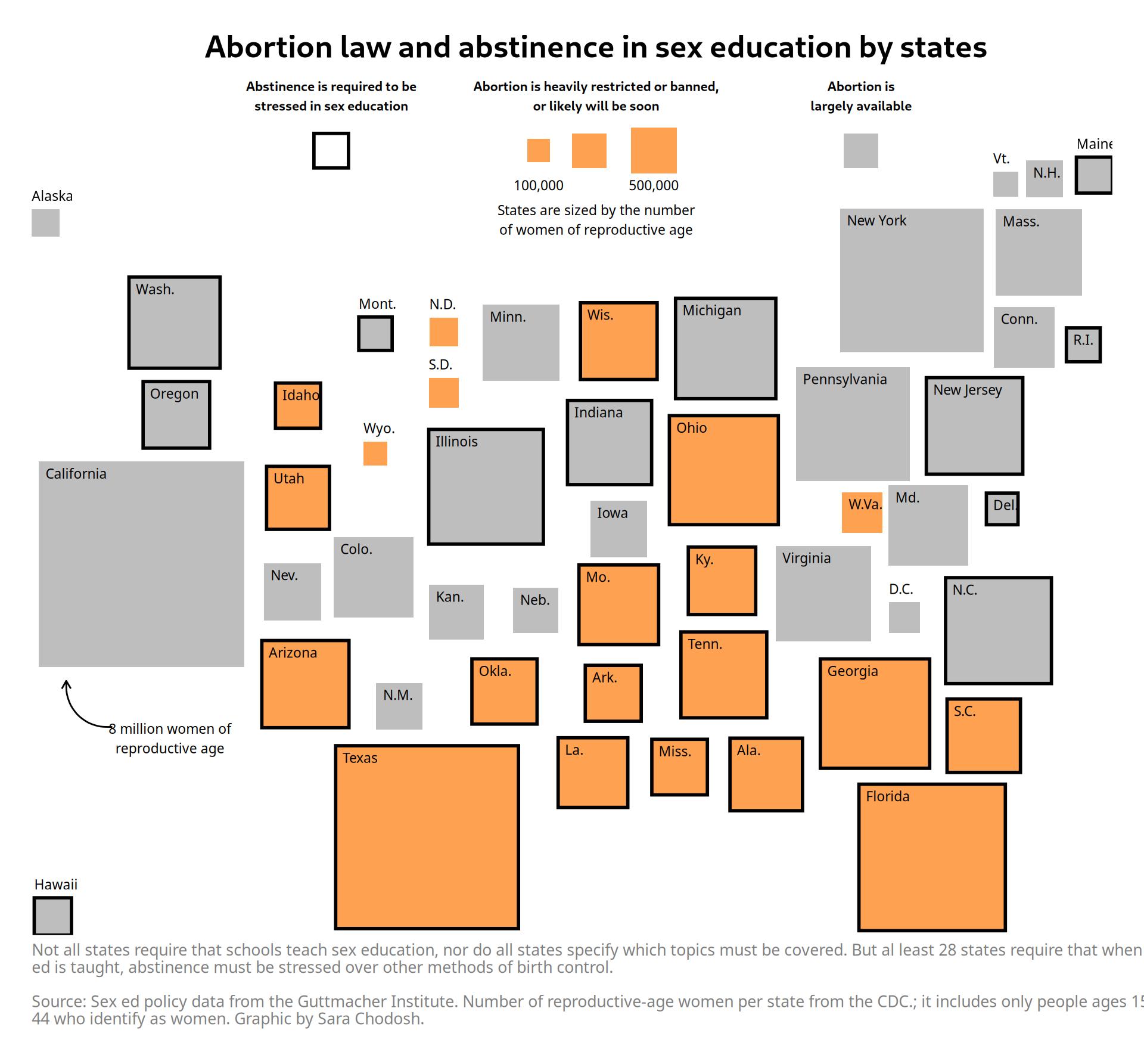
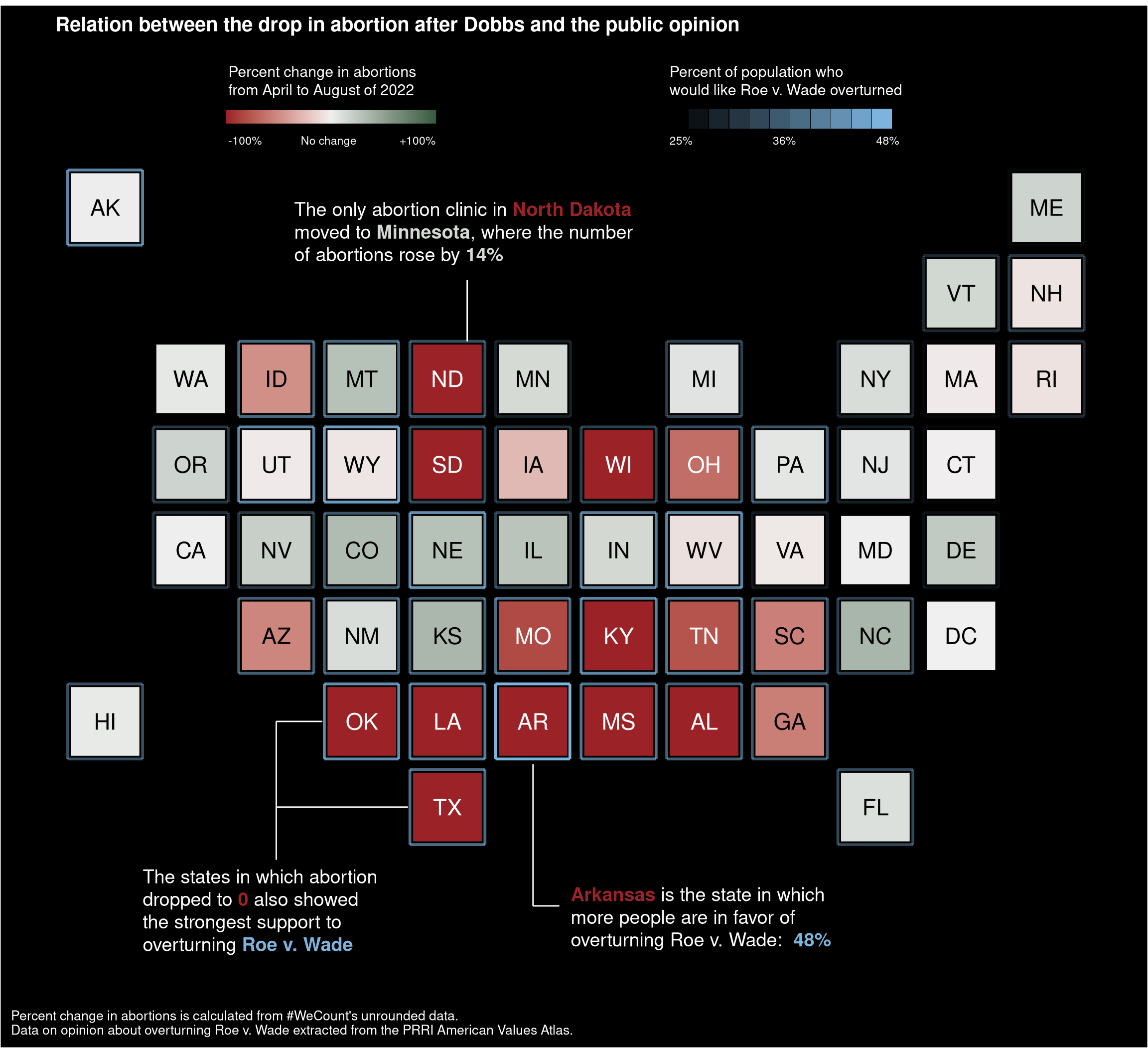
Abortion Access in the USA
A visual look at how access to abortion clinics has changed across the United States since the overturning of Roe v. Wade.
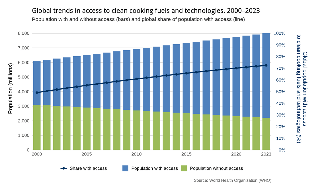
Clean Fuels and Tech for Cooking
My visualization project analyzing global trends in access to clean cooking fuels and technologies from 2000 to 2023.
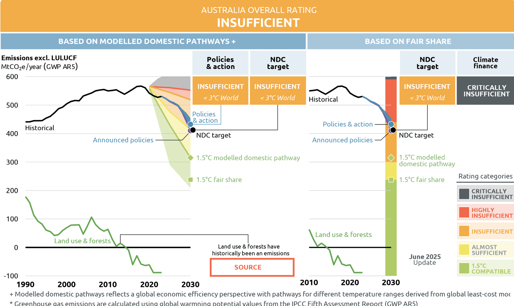
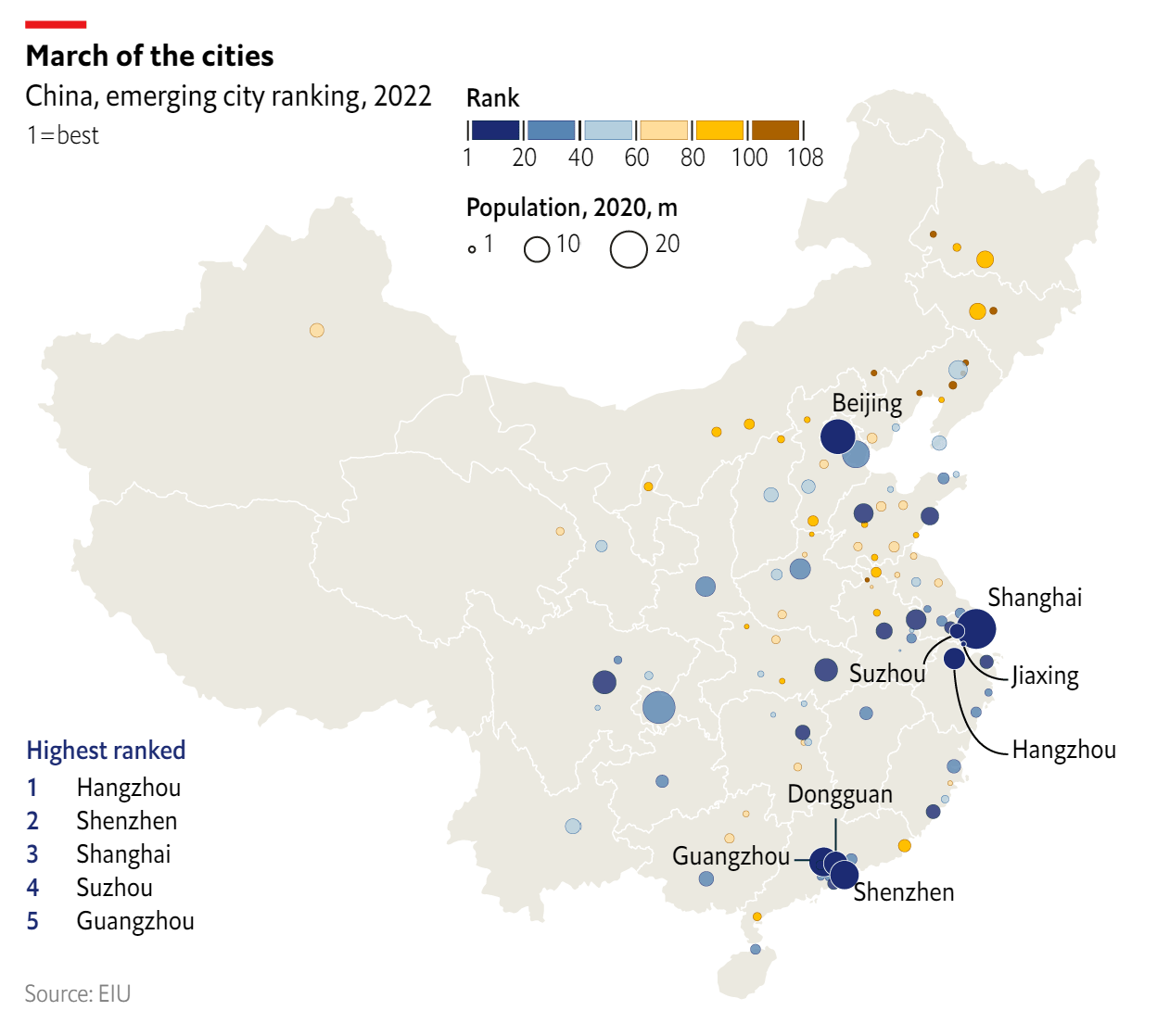
CAT: Australia Country Profile
This article details the process of replicating a graph of the Australian Country Profile created by Climate Action Tracker (CAT) in 2025.
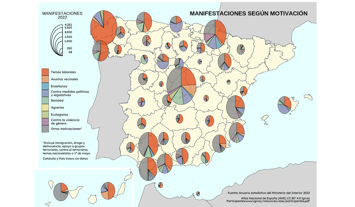
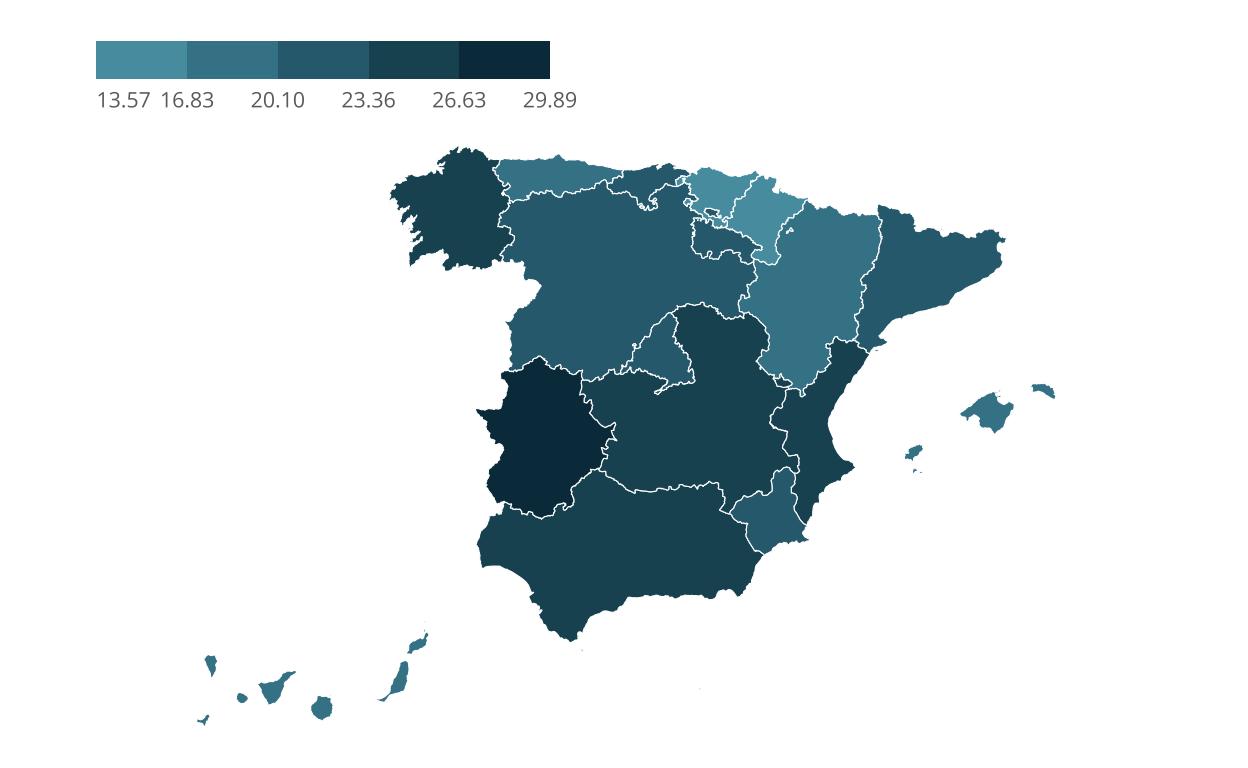
Protests motives distribution across spanish regions
Map graph with pie charts from Spanish National Atlas (ANE) that shows protests motives distribution across spanish provinces in 2022. The represented data comes from the 2022 statistical yearbook on protests published by the Spanish Ministry of Interior.
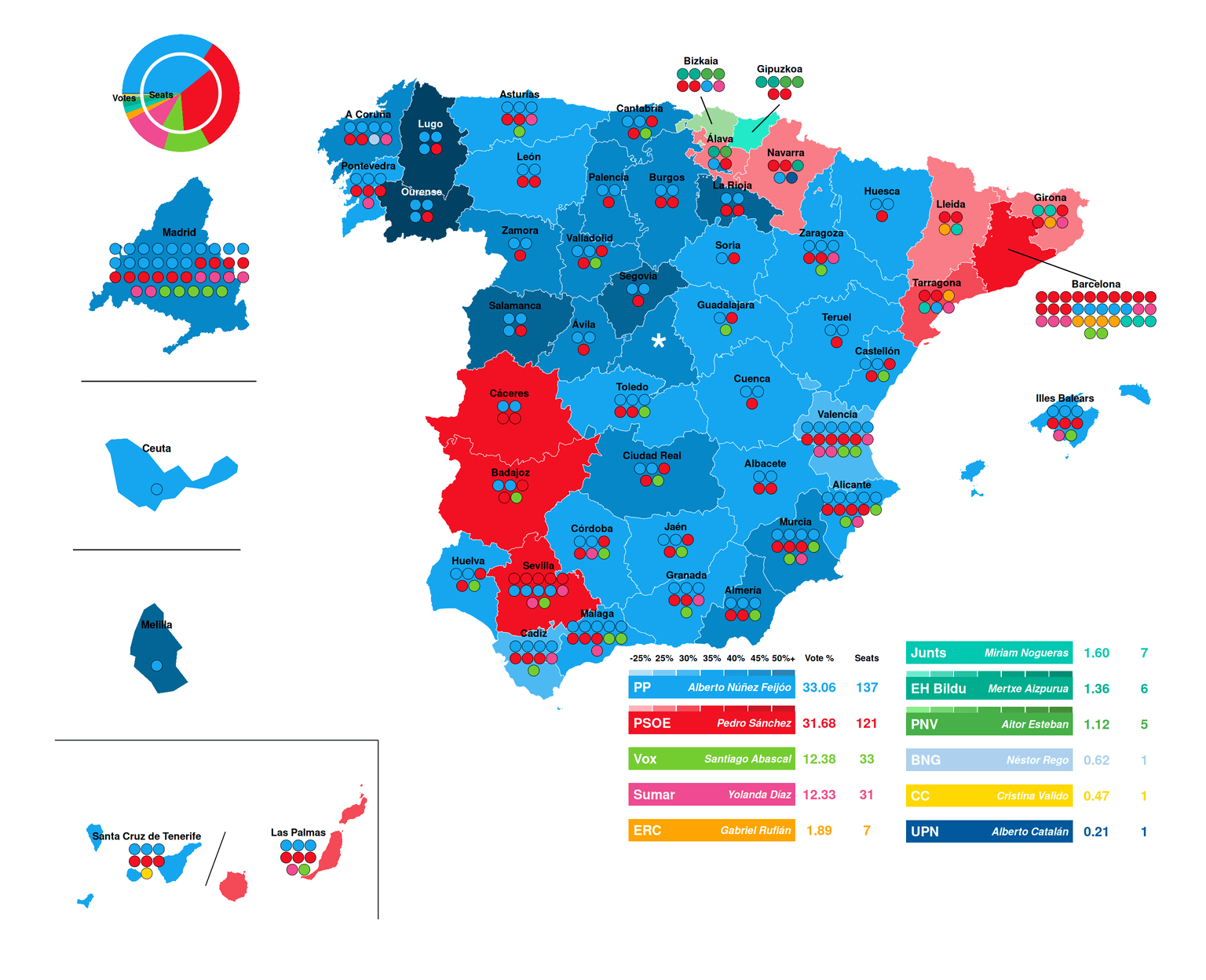
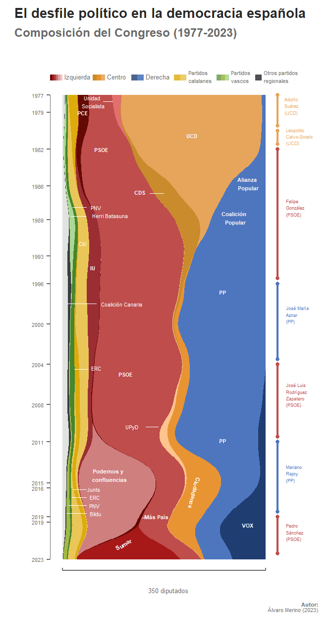
2023 Spanish National Election Map
This project focuses on the replication of a selected data visualization of the Spannish General Election 2023 in order to faithfully reproduce its structure, visual encodings, and underlying data transformations.
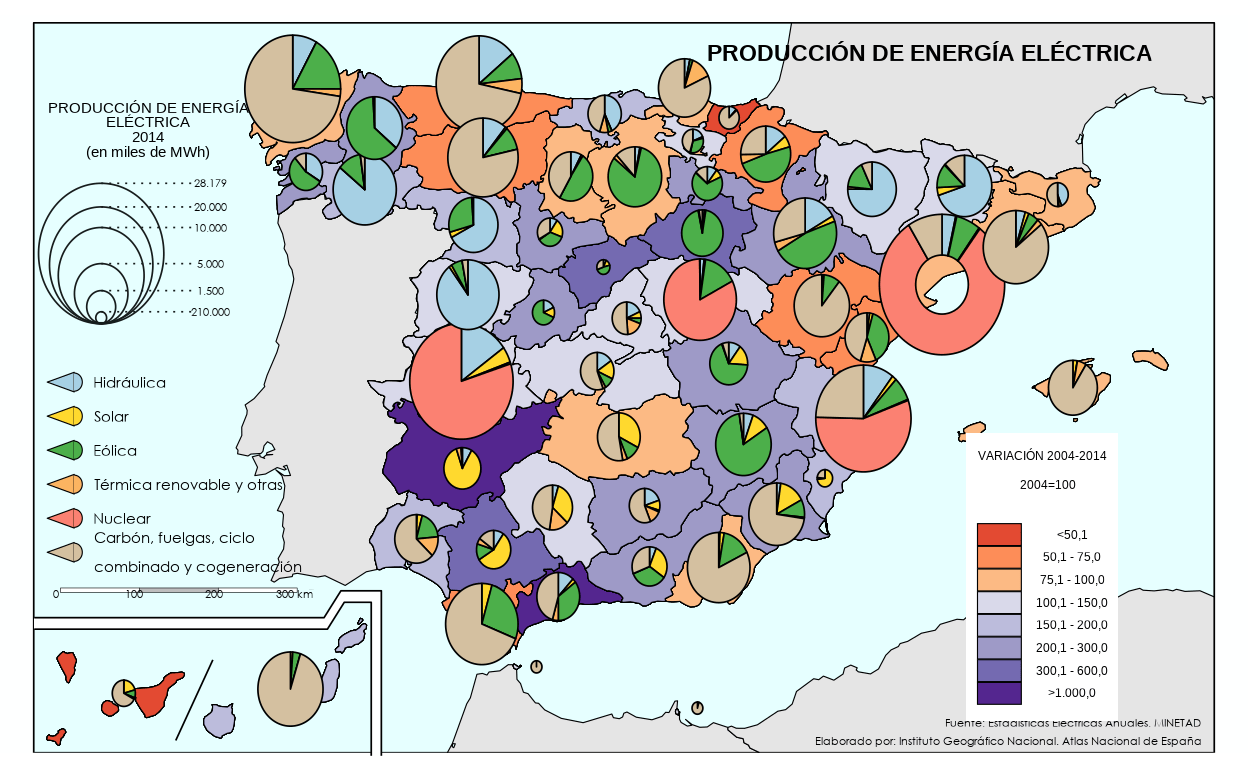
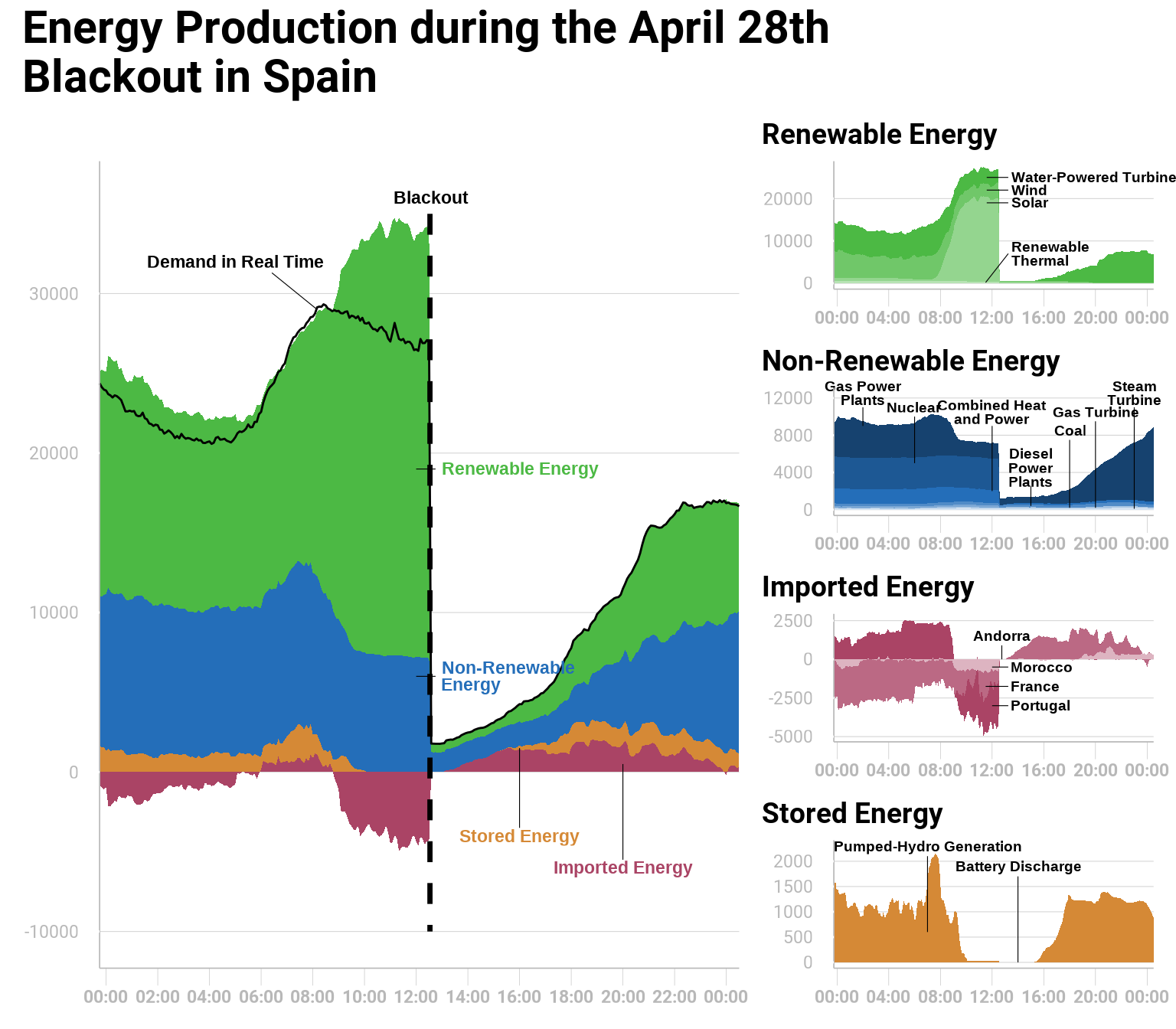
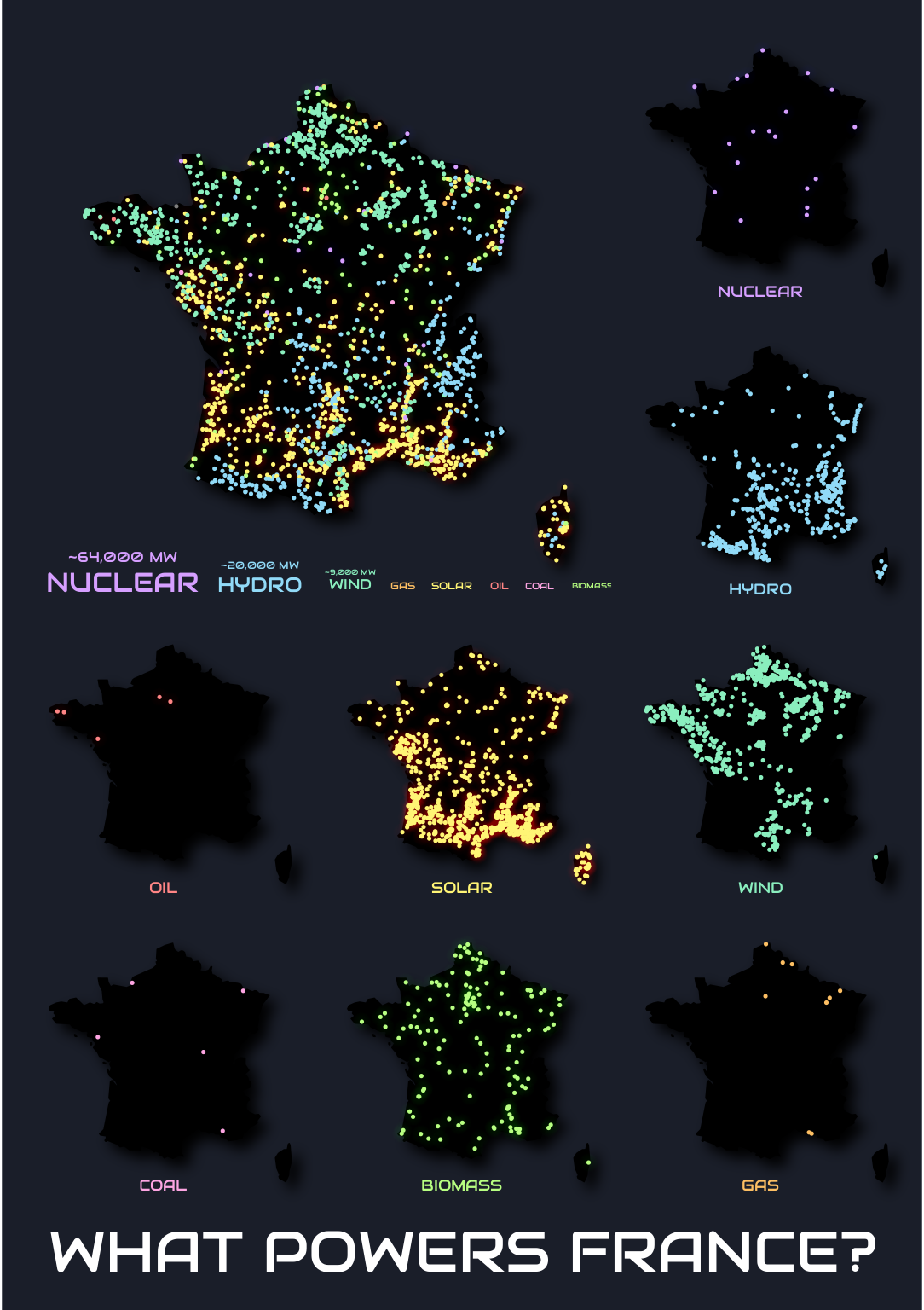
Energy Production between 2004 and 2014
This tutorial will replicate and improve a map full of pie charts. It is a perfect example of an information saturated visualization, since it uses a map to represent the total electric energy production as of 2014 by province, its energy sources and the production variation between 2004 and 2014. The objective of this tutorial is to demostrate that, most of the times, less is more.
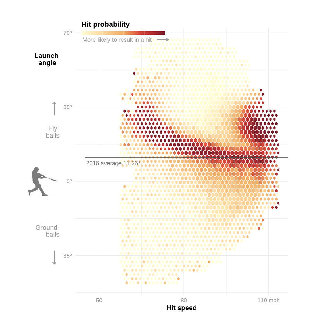
Statcast Baseball Heatmap
Replicating and recreating a graph that looks at hit success as a function of launch angle and velocity.
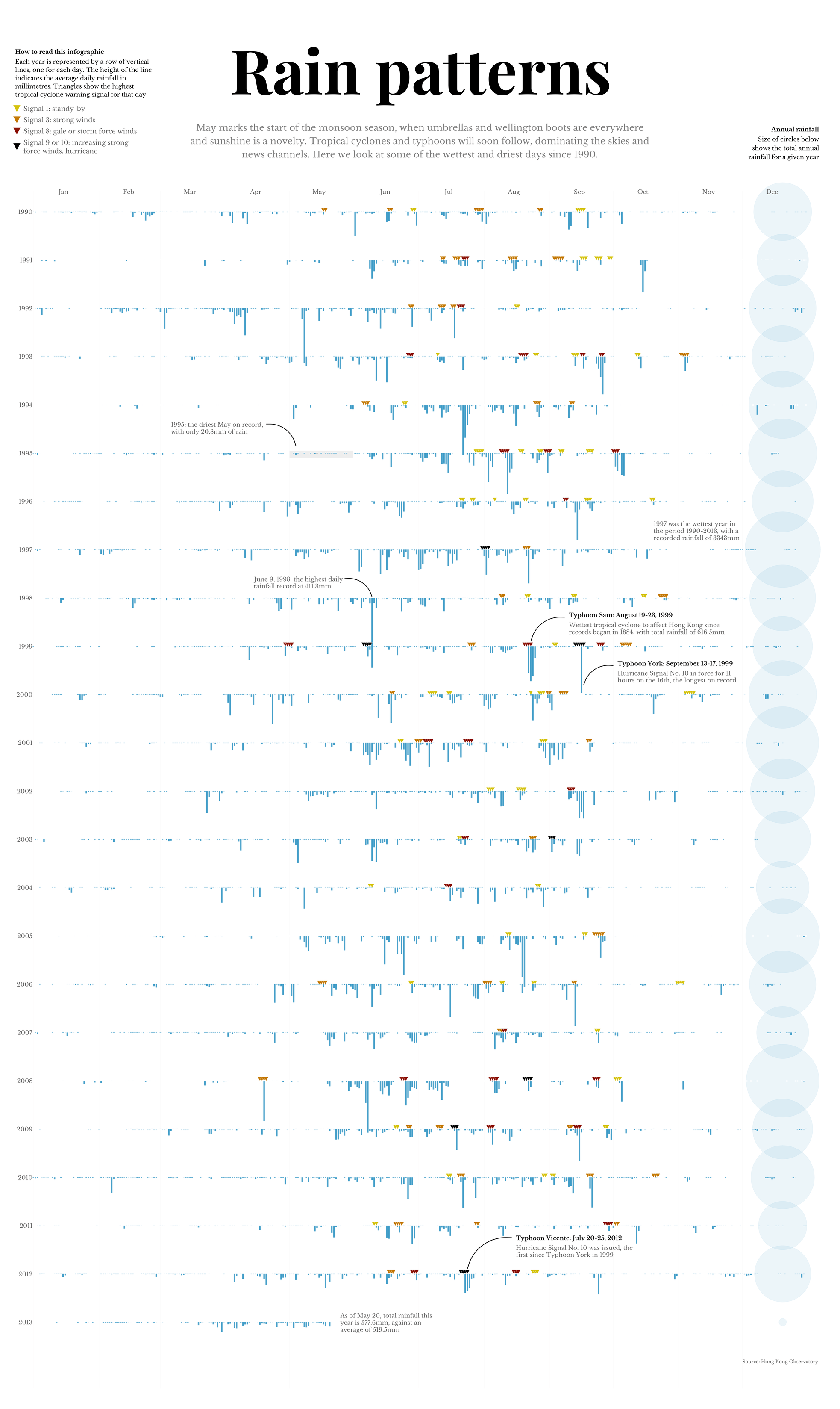
Rain Patterns in Hong Kong
Replication and improvement of a rainfall visualization from the South China Morning Post.
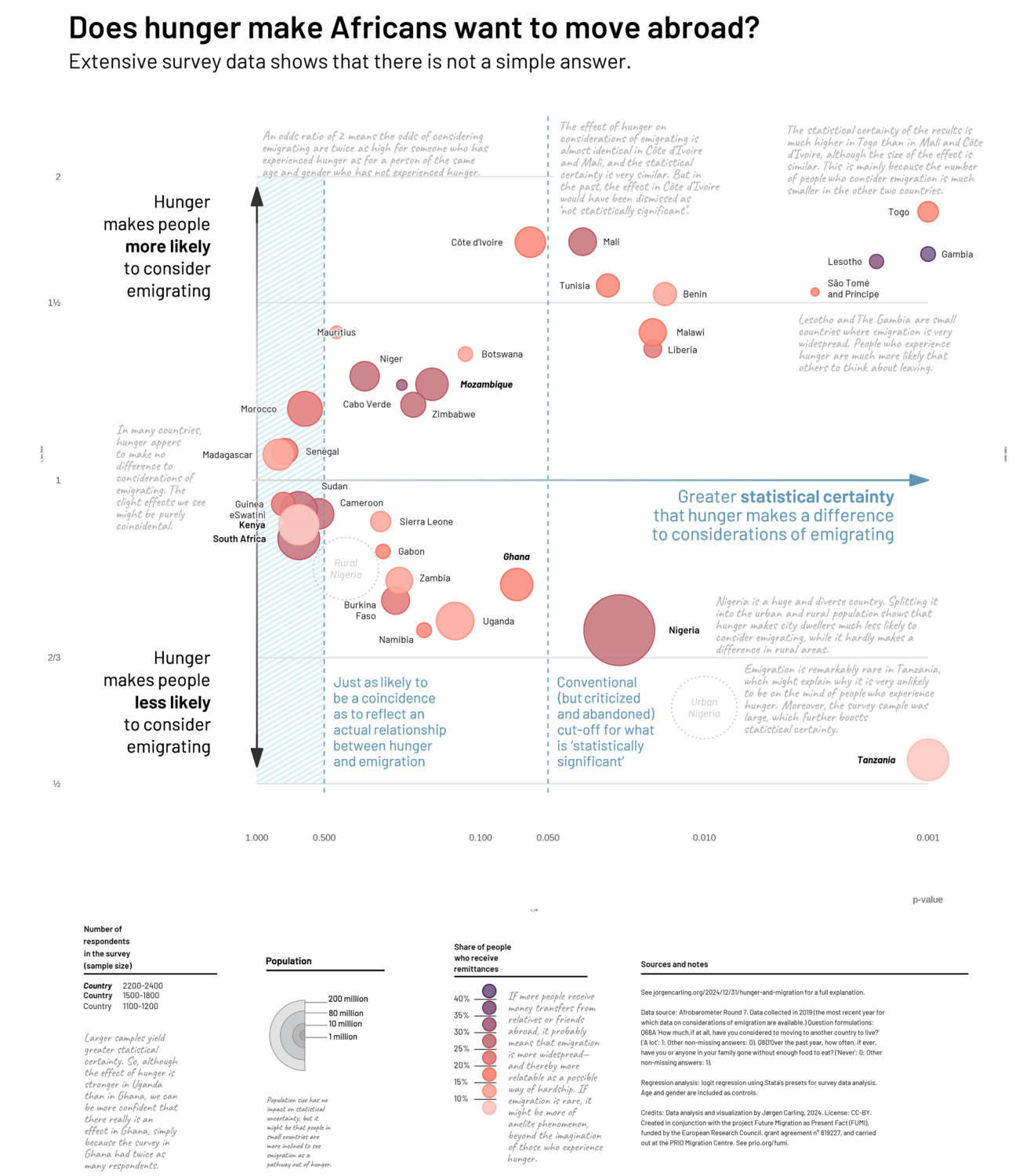
Does hunger make Africans want to move abroad?
Analysis of the relationship between hunger and emigration
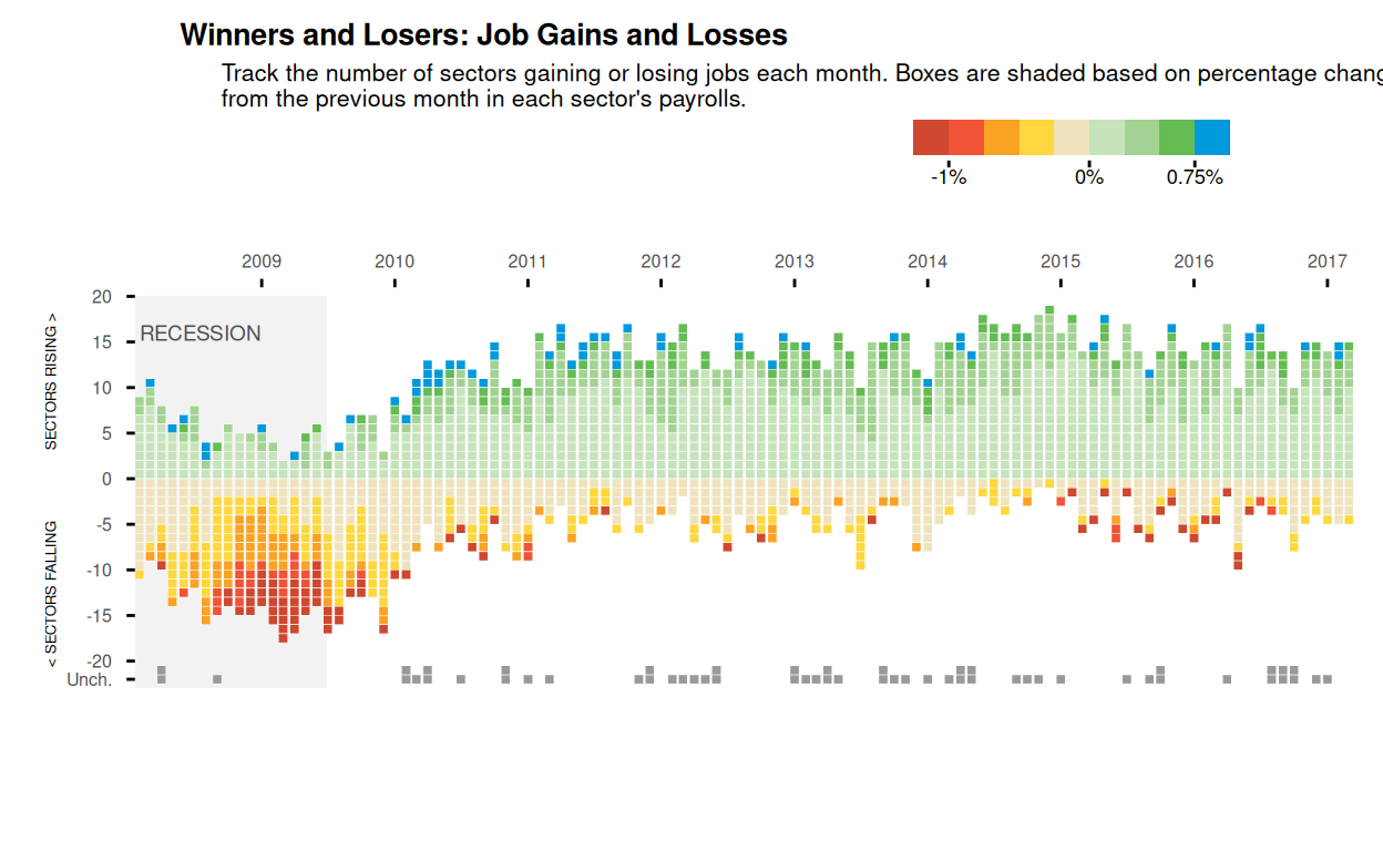
Track National Unemployment: Job Gains and Job Losses
National Unemployment, Job Gains and Job Losses.
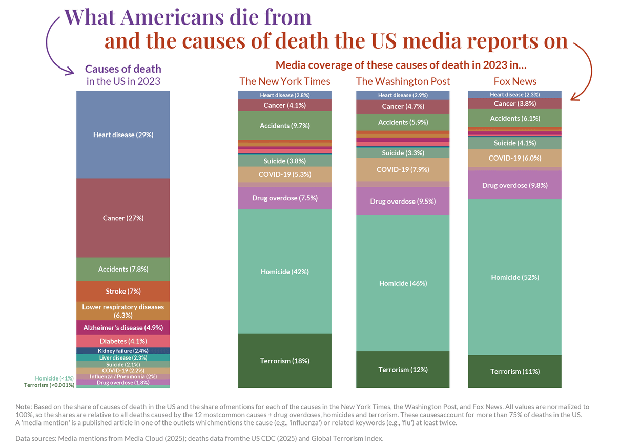
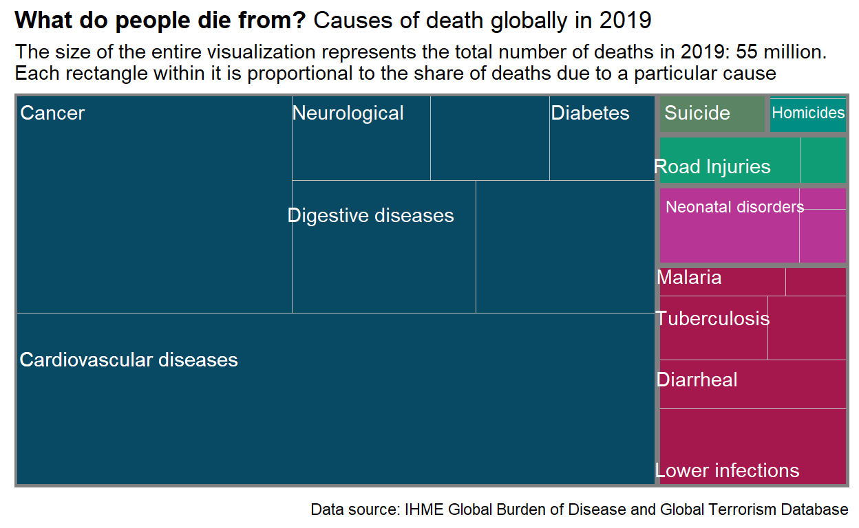
Comparing Causes of Death and their Media Coverage in the United States
In this post I recreate a graph from Our World in Data that illustrates the causes of death in the United States in 2023 and their media coverage. I also present an alternative visualization of the data.
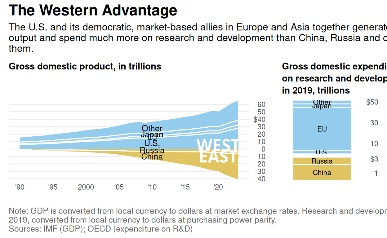
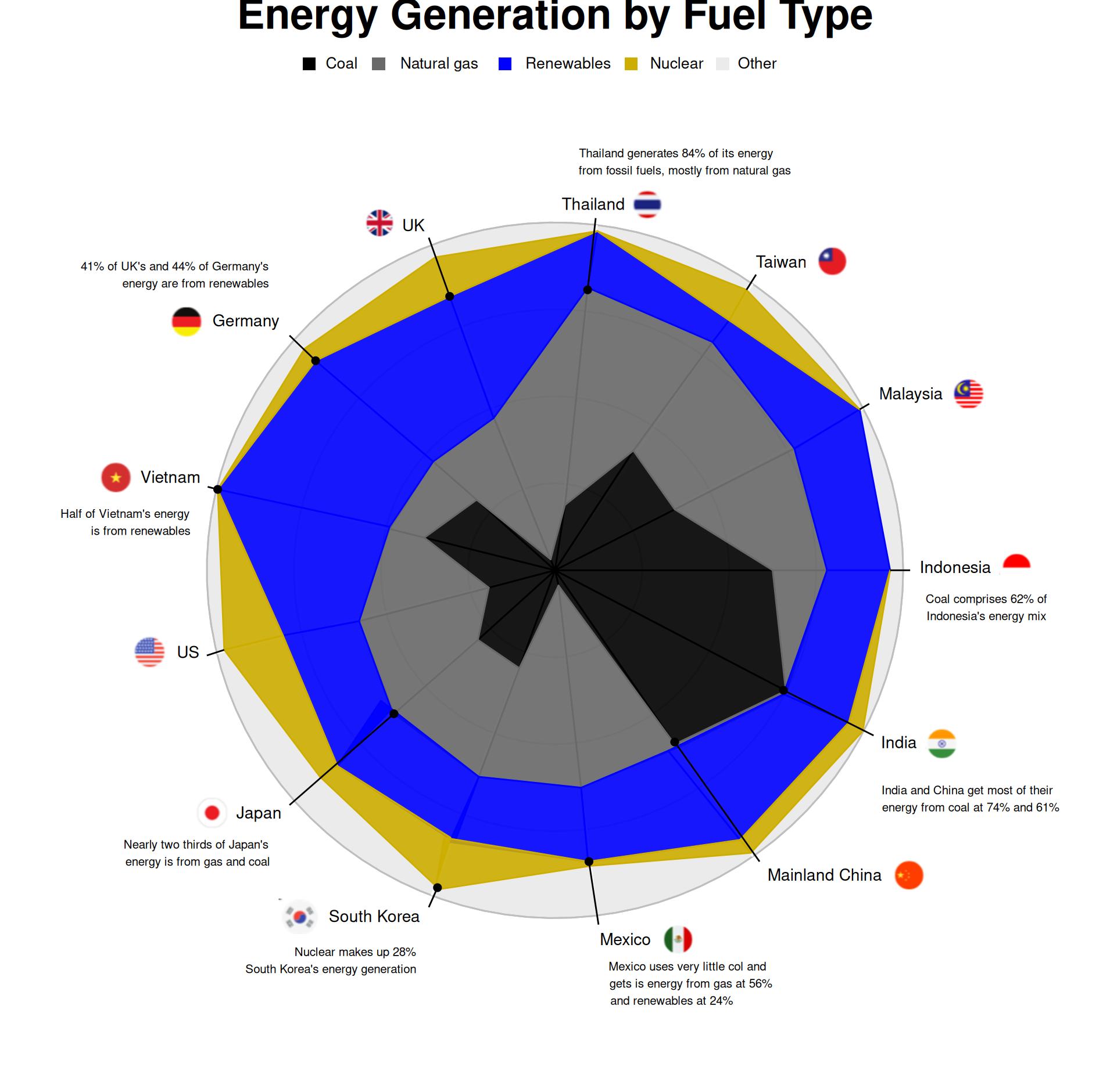
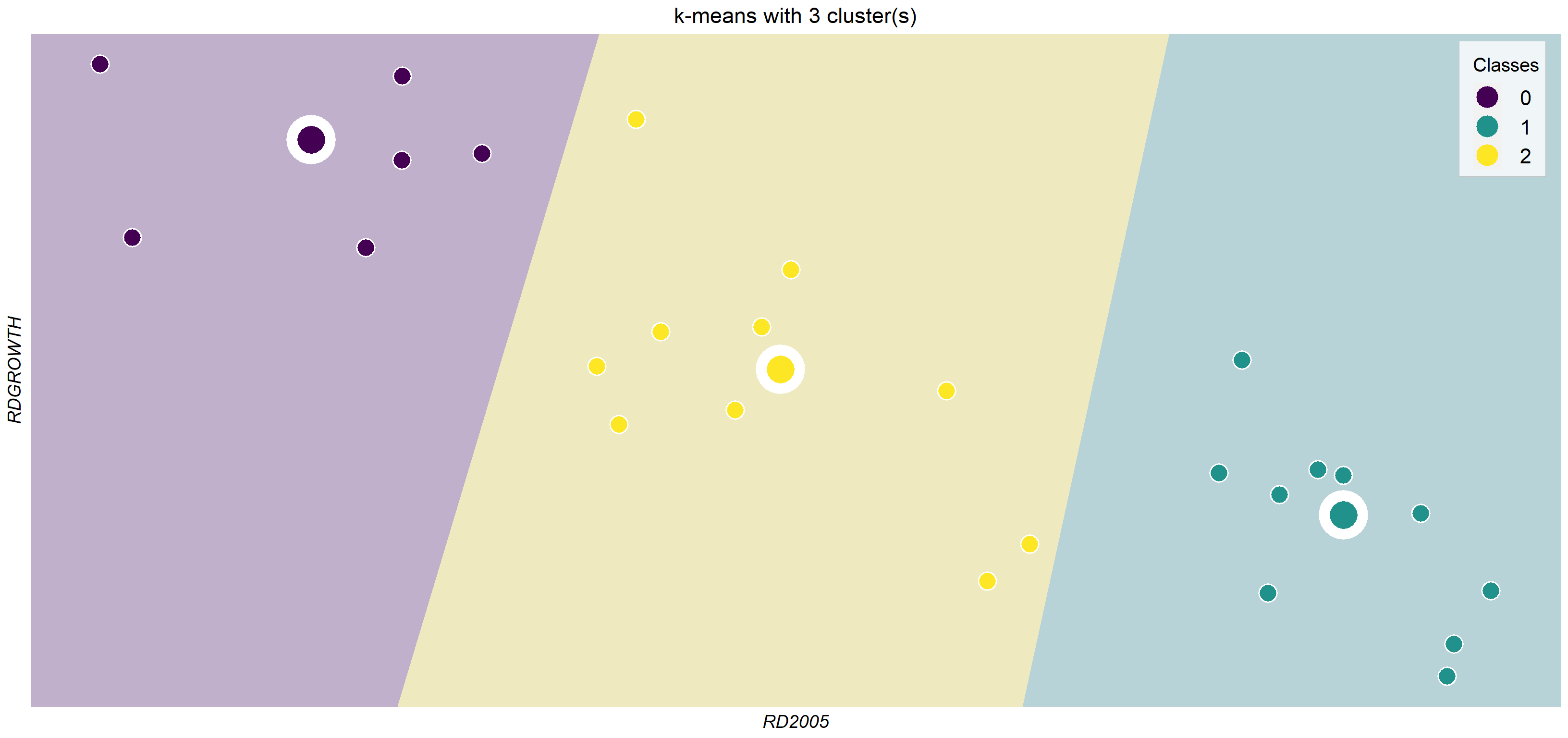
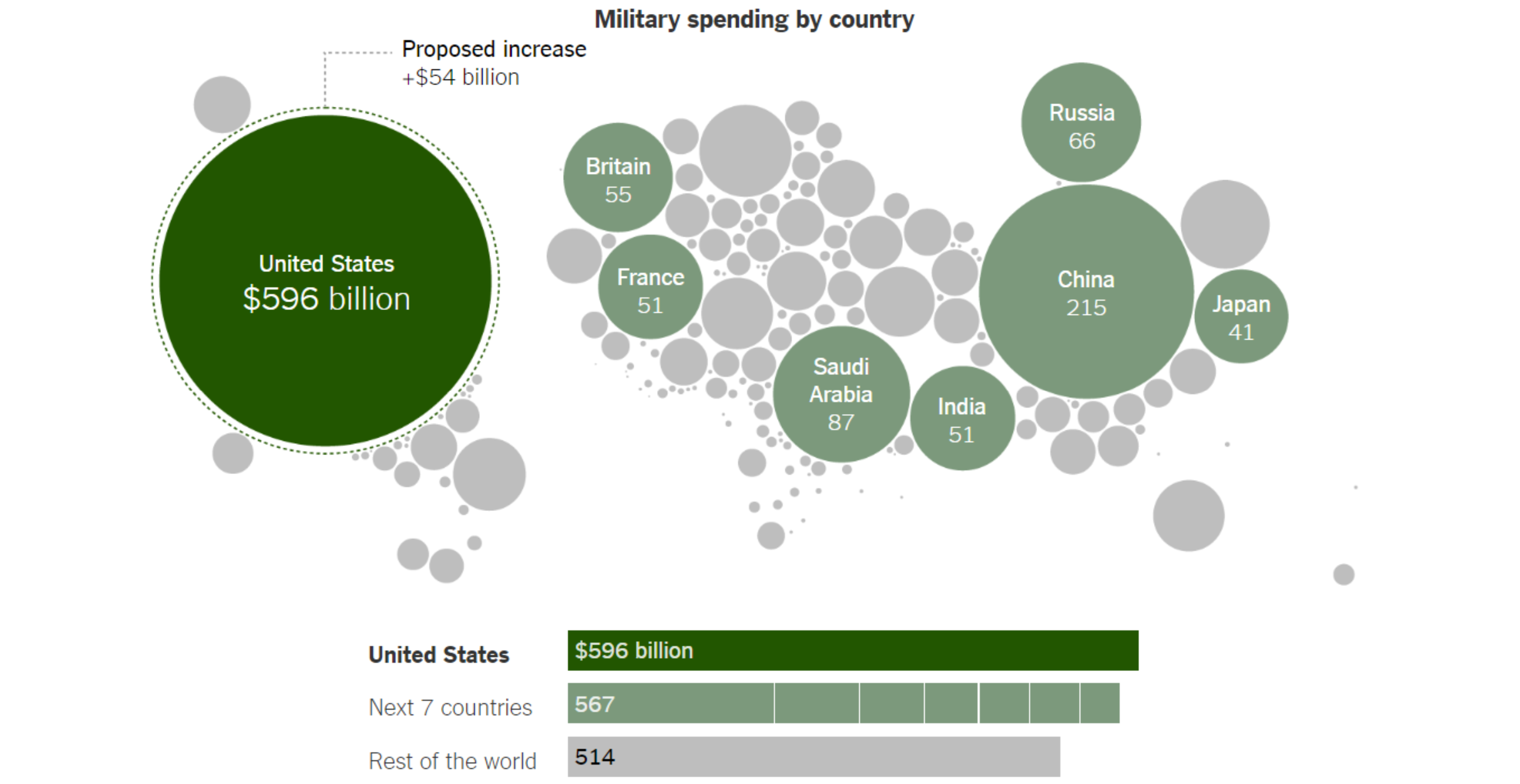
R&D investment spending. West vs East
This work tries to replicate the graph exposed in the WSJ article "How the West Can Win a Global Power Struggle". Hence, GDP and investment in R&D is presented for a set of countries of the East and West block.
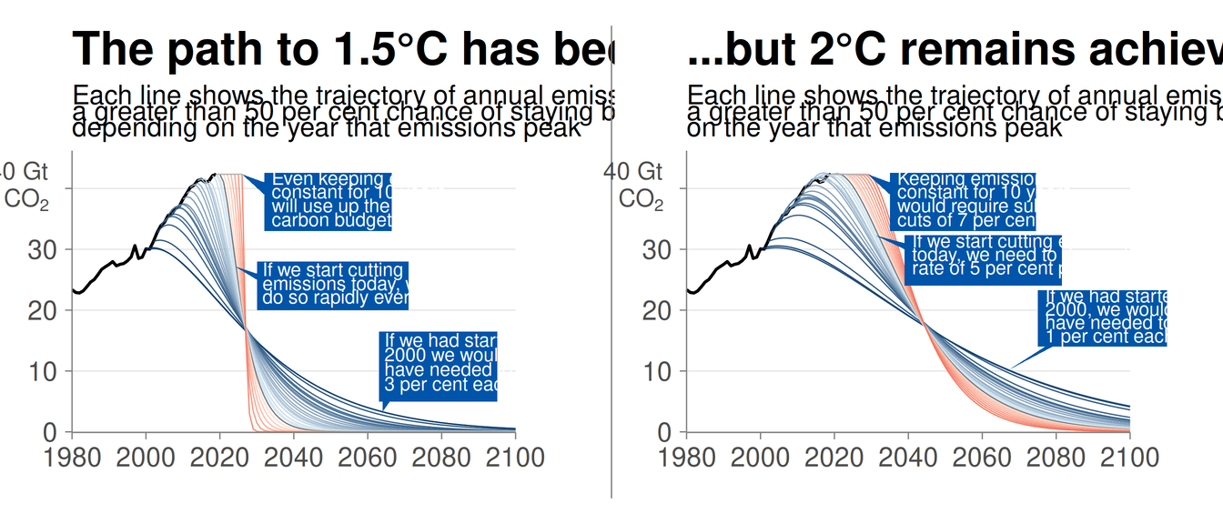
The path to 1.5 Celsius
Robbie Andrew's mitigation curves required to meet the Paris Agreement's 1.5°C and 2°C targets.
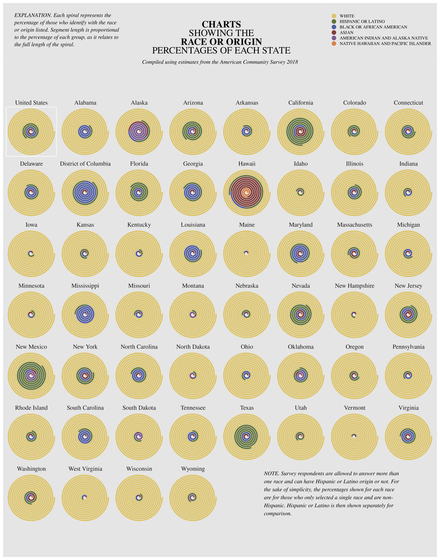
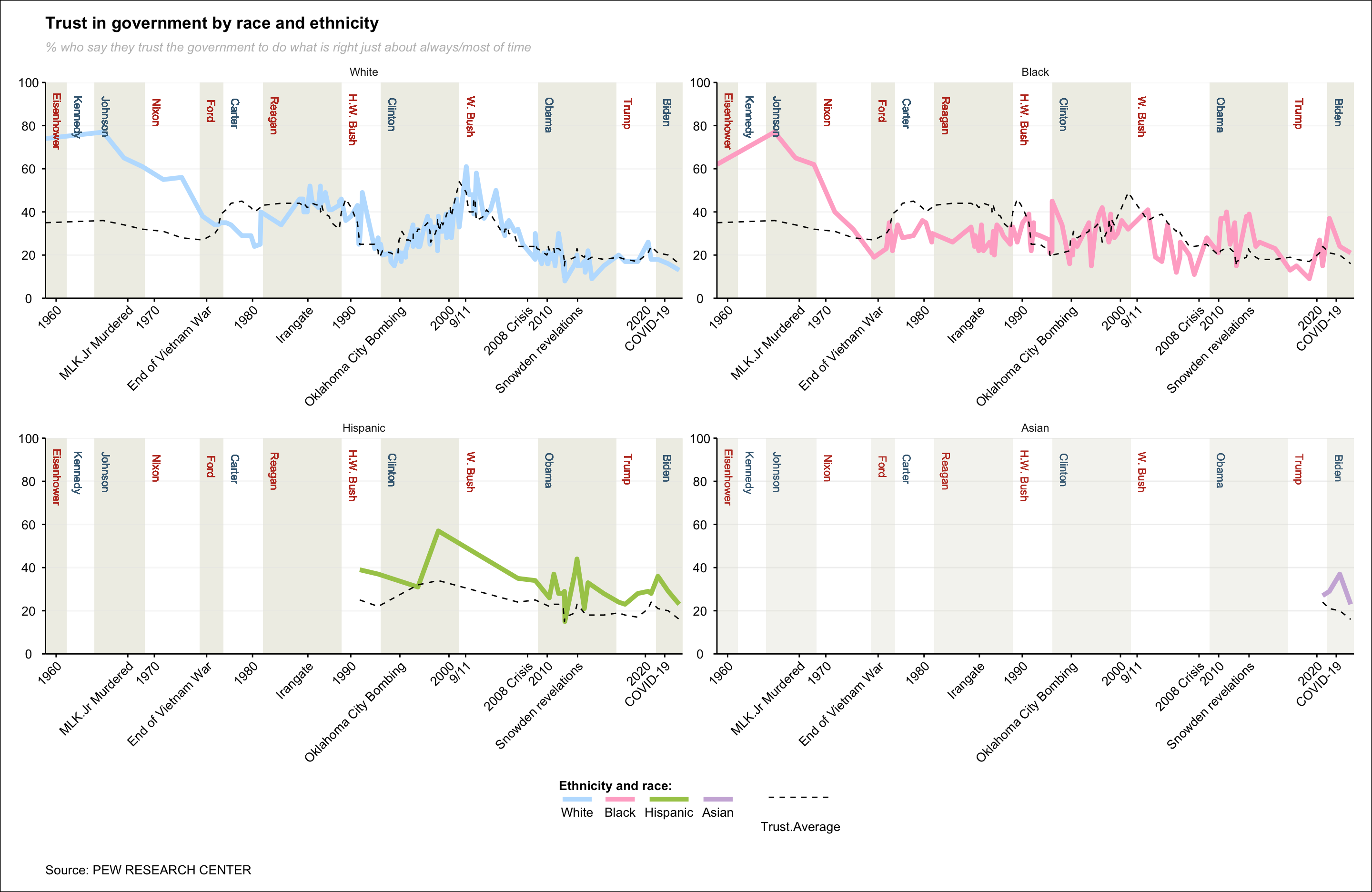
Showing The Race or Origin Percentages of Each State
Replicating spiral charts and exploring alternative designs for better clarity and comparison.
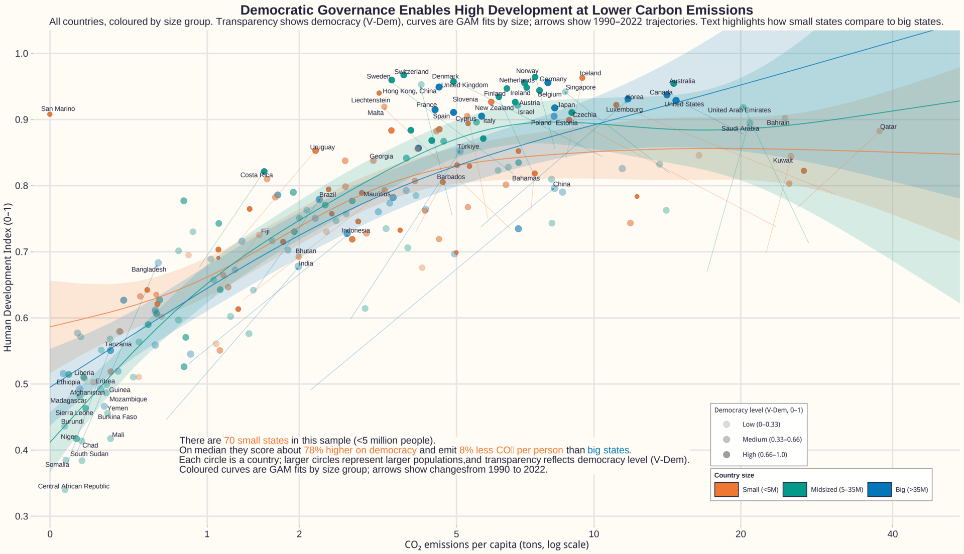
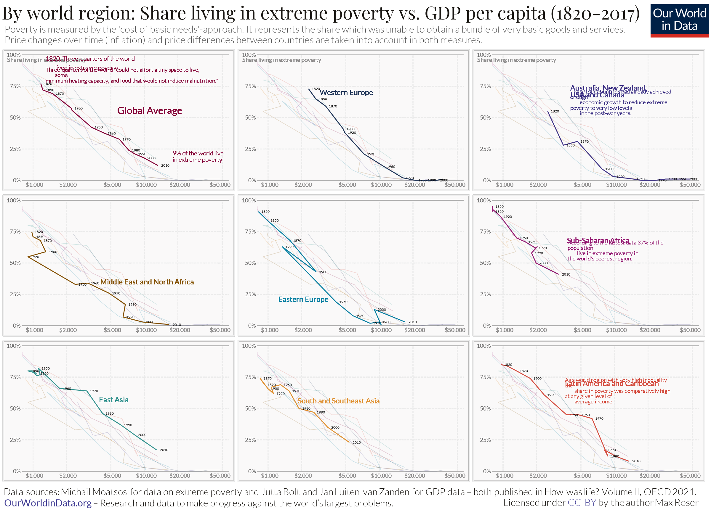
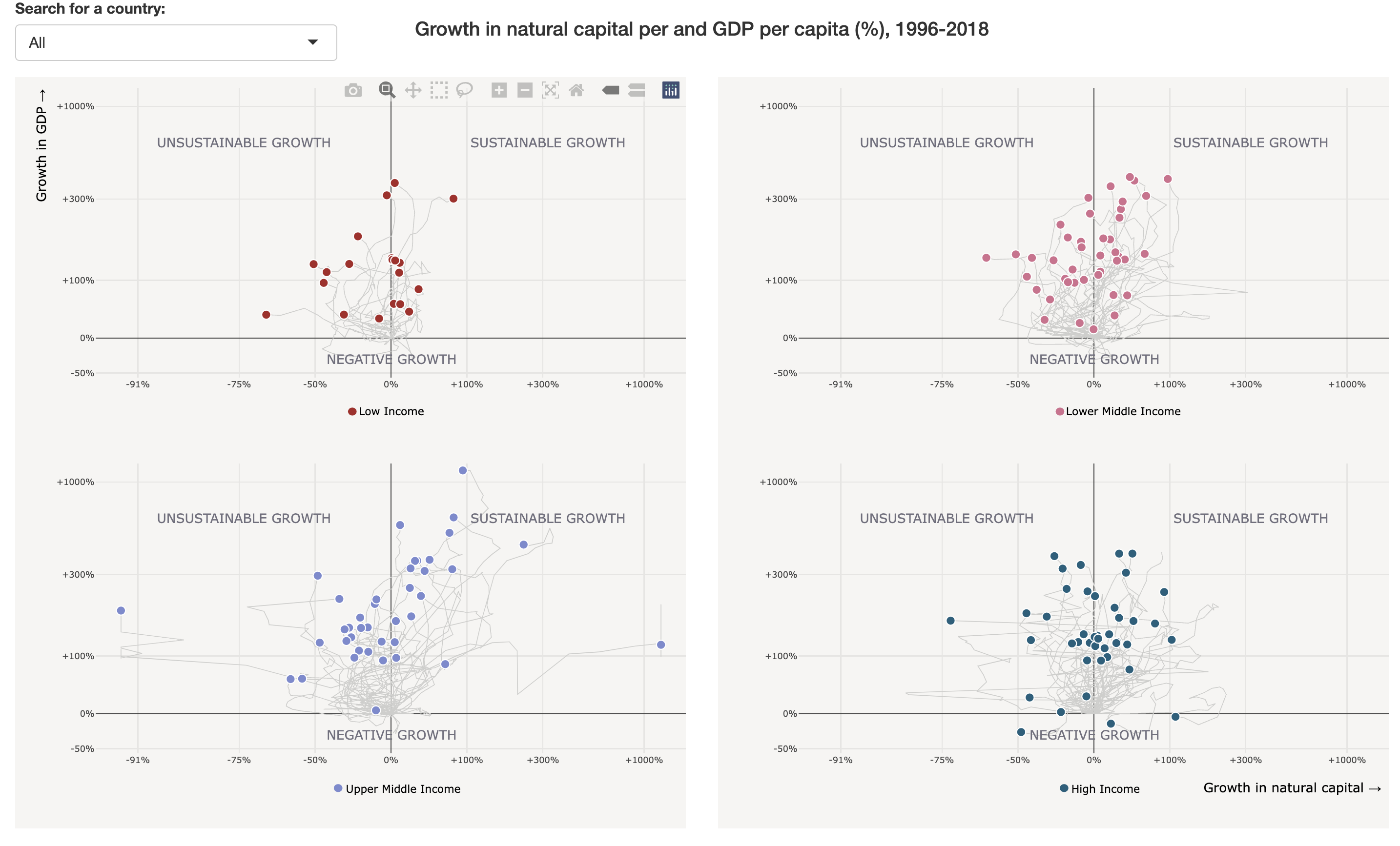
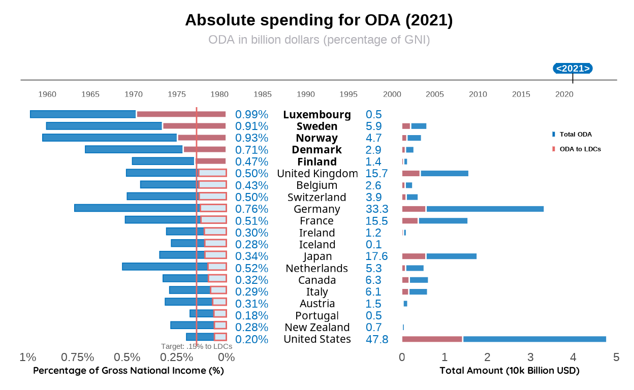
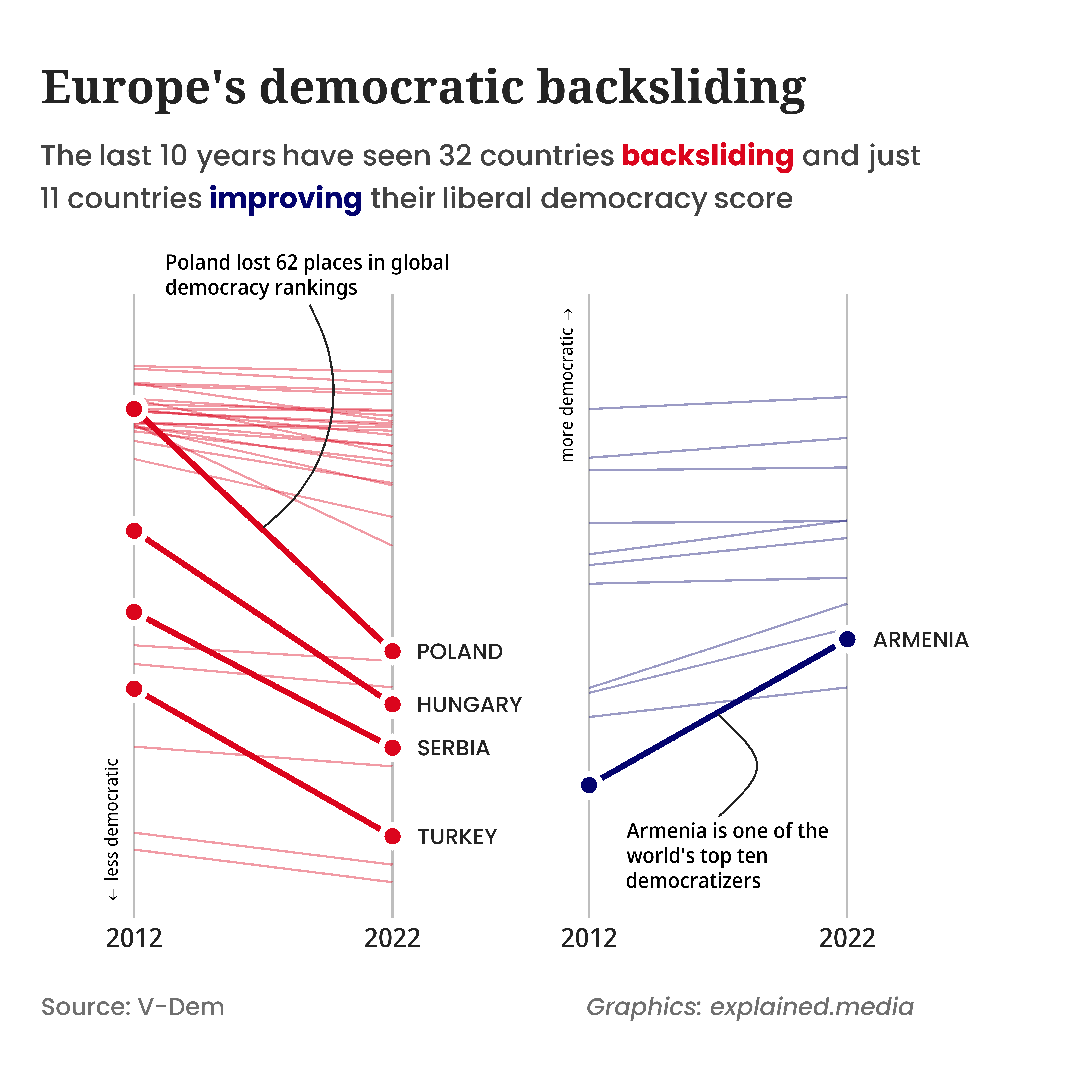
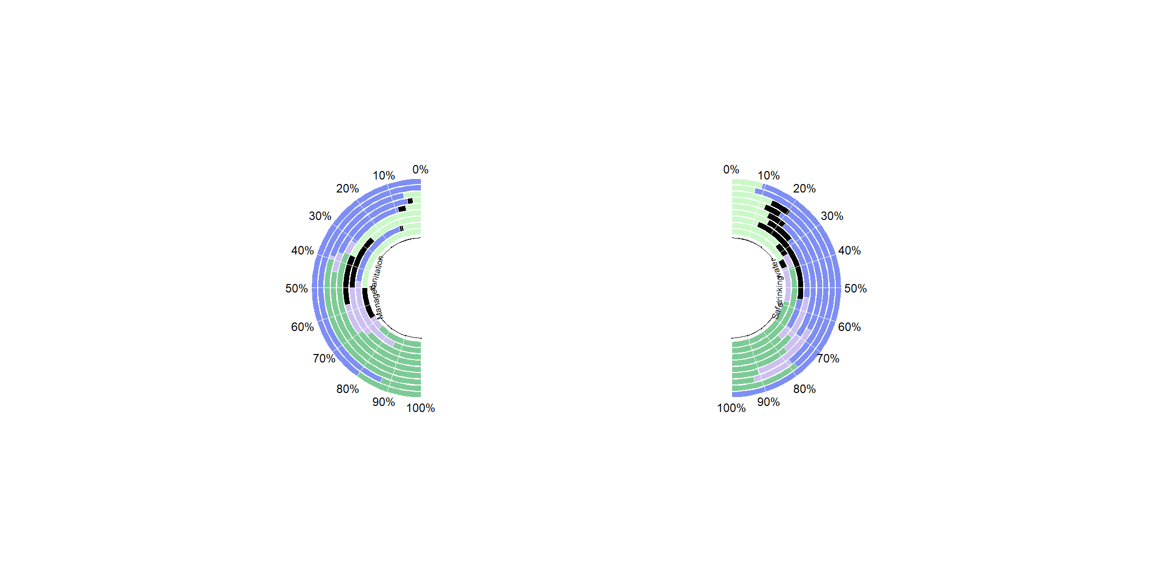
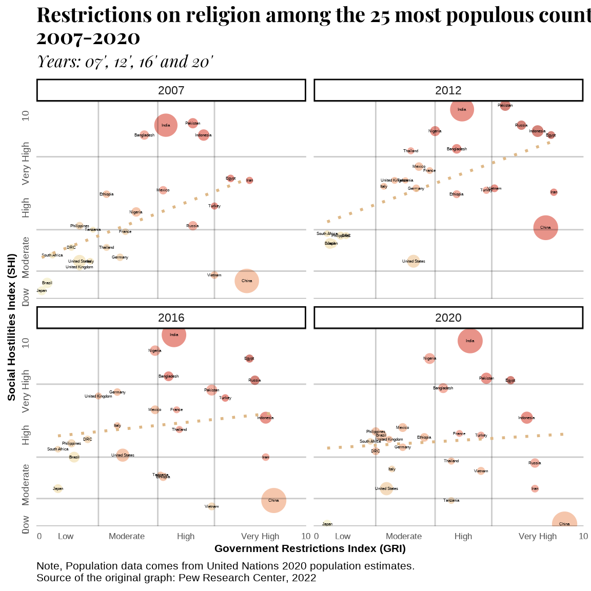
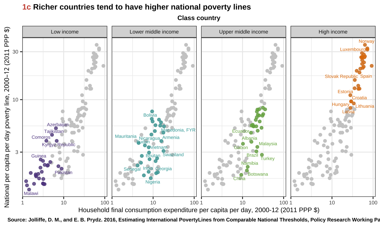
Small Stats Can Be Big Players in Development and Good Governance
This report reconstructs the “Small States Can Be Big Players in Development and Good Governance” figure using R, combining World Bank, UNDP, and V-Dem data in a fully reproducible workflow.
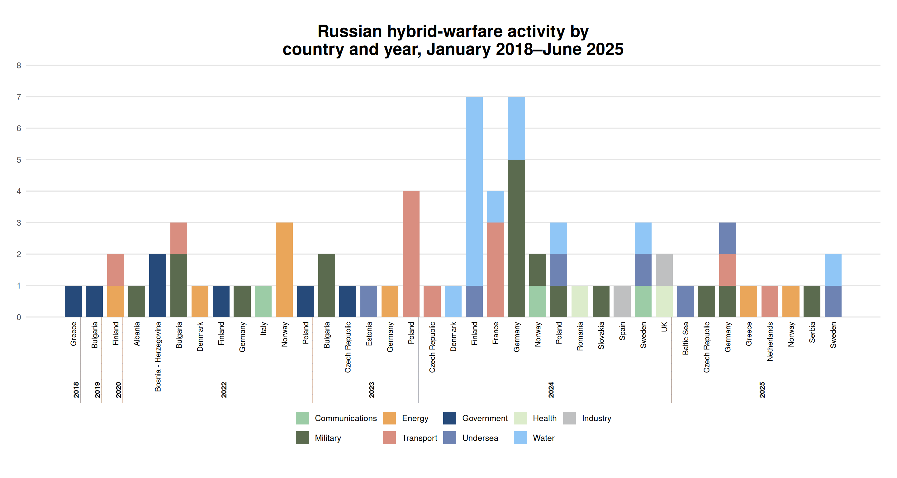
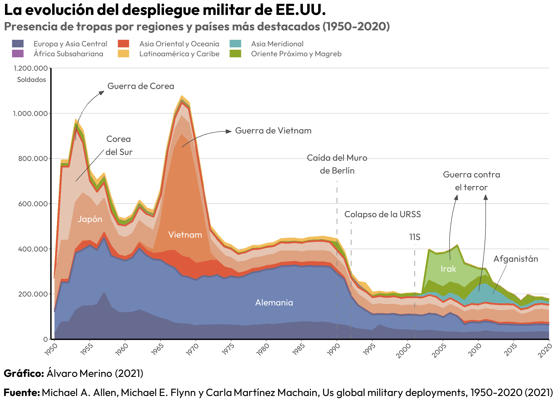
Replica of Russian Hybrid Warfare Activity
My project is a replication of the Russian hybrid warfare activity chart from the International Institute of Strategic Studies.
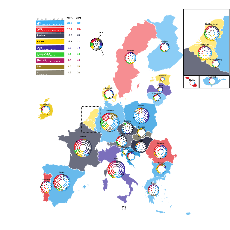
Europe Elects - Visualising the 2024 European Parliament Elections
Exploring how thoughtful visual design allows election data to be seen, compared, and understood beyond numbers.
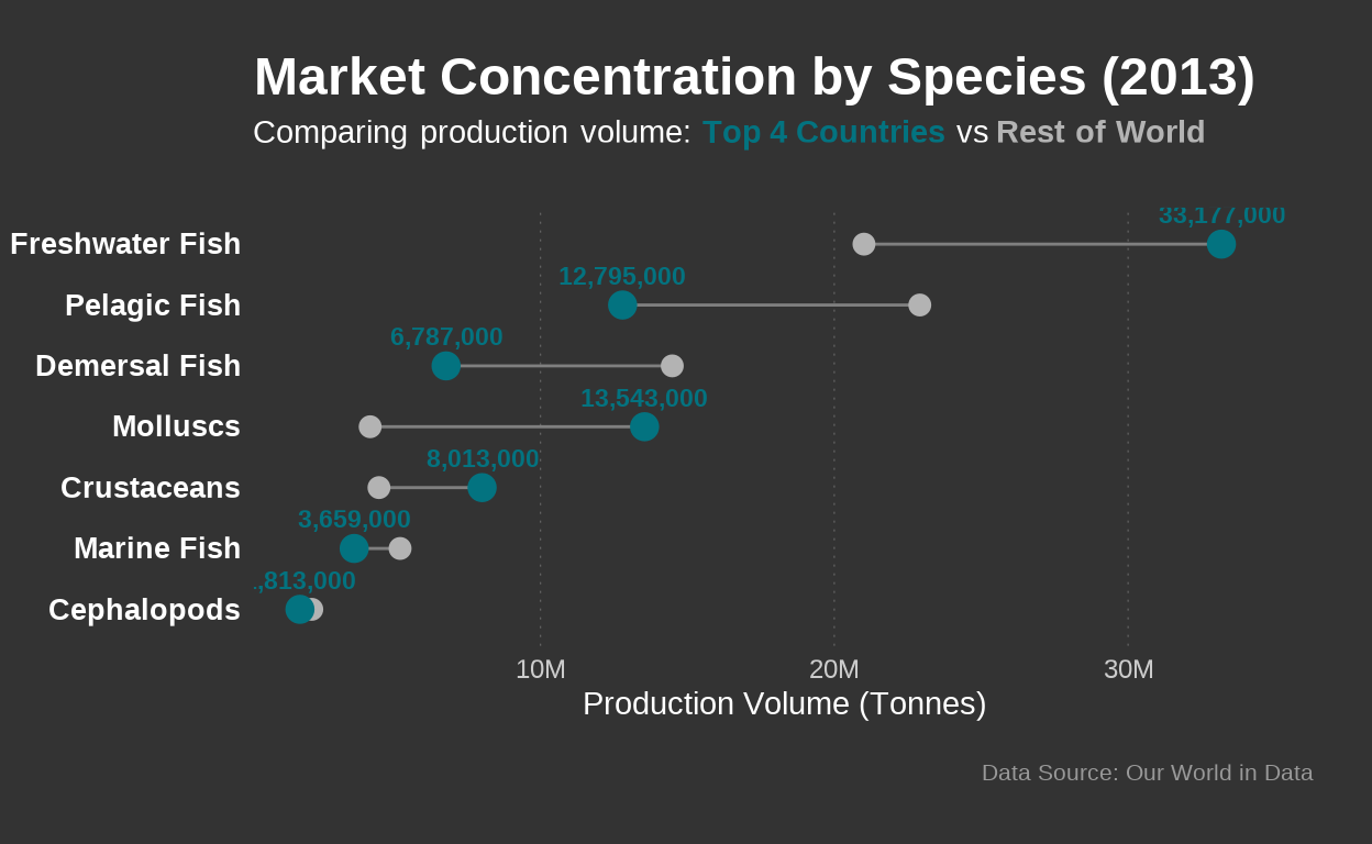
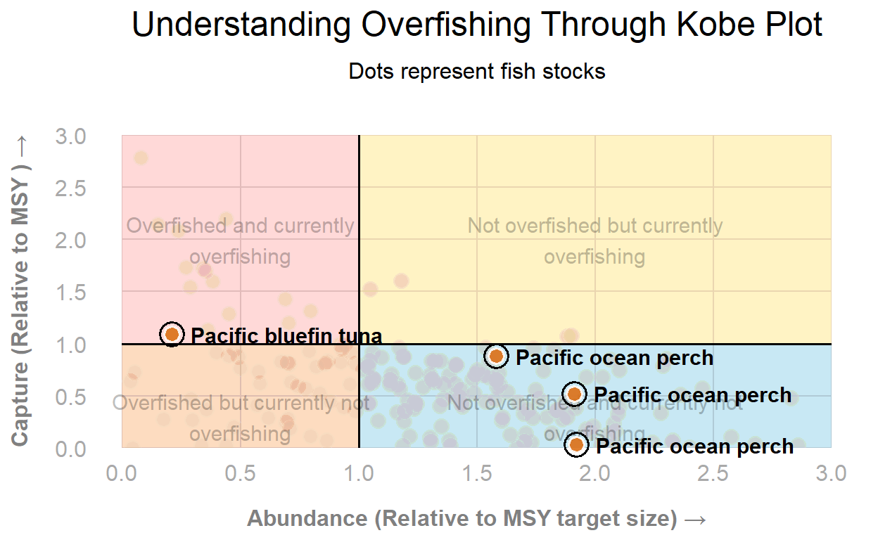
Global Seafood Production
Analysizing how the seafood industry changed over the year.
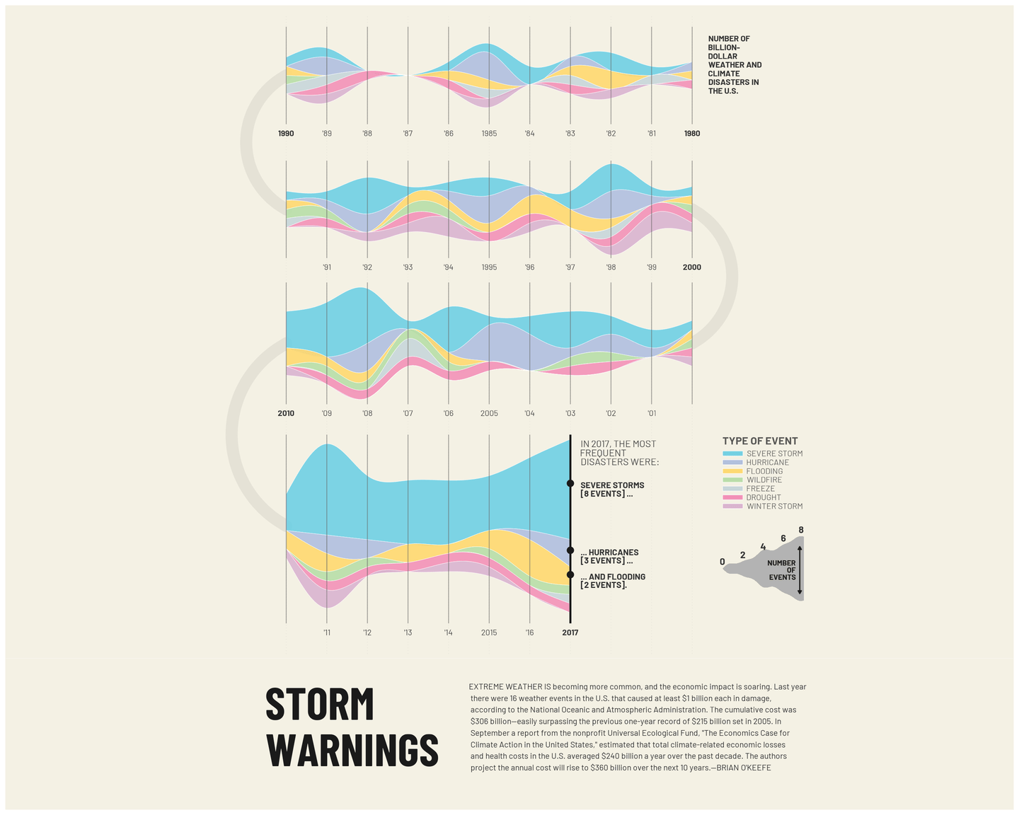
Billion Dollar Weather and Climate Disasters in the U.S.
Recreation of Fortune Magazine's visualization showing the increase in billion-dollar climate disasters in the U.S. from 1980-2017
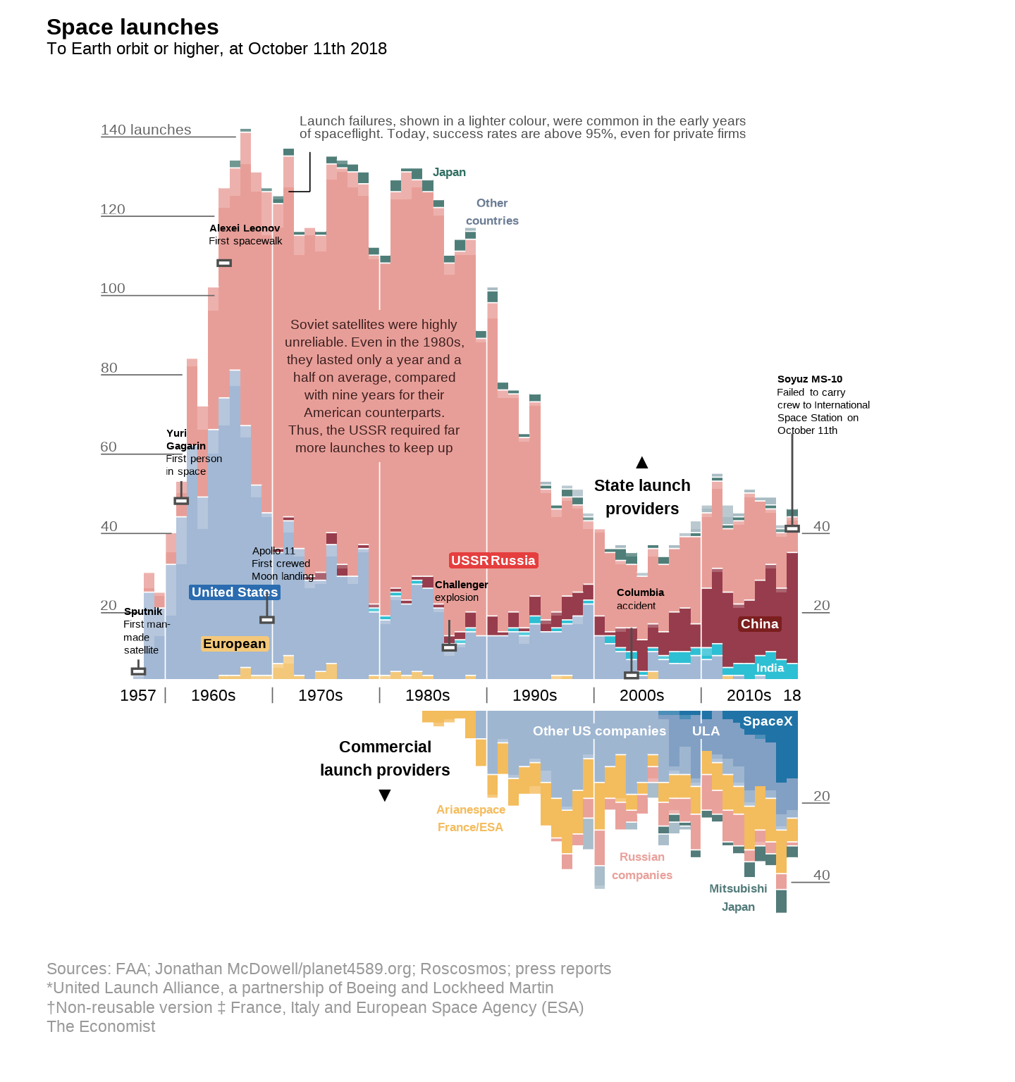
The Space Race: From Cold War Duopoly to Rising Powers
A snapshot of global space launches from 1957 to 2018, highlighting the shift from Cold War superpower dominance to a space race led by rising powers and private companies.
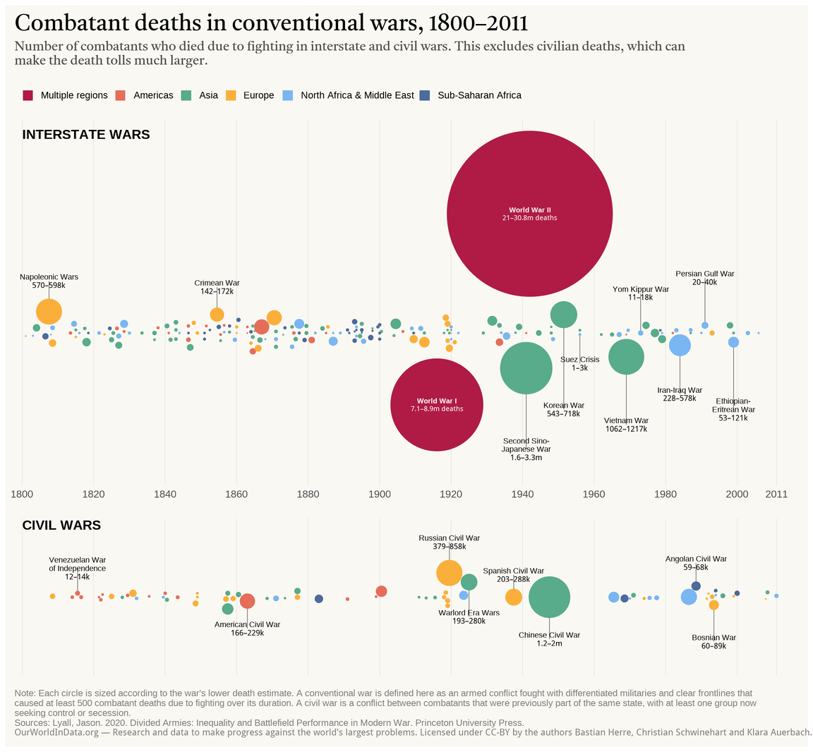
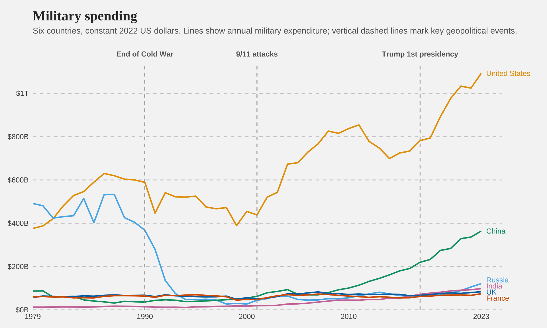
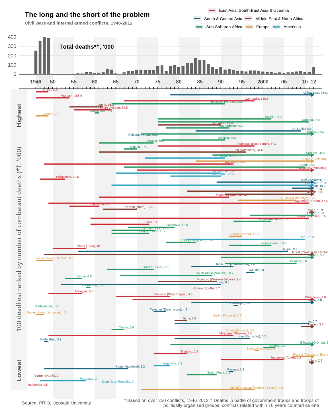
Combatant deaths in conventional wars, 1800-2011
Number of combatants who died due to fighting in interstate and civil wars. This excludes civilian deaths, which can make the death tolls much larger.
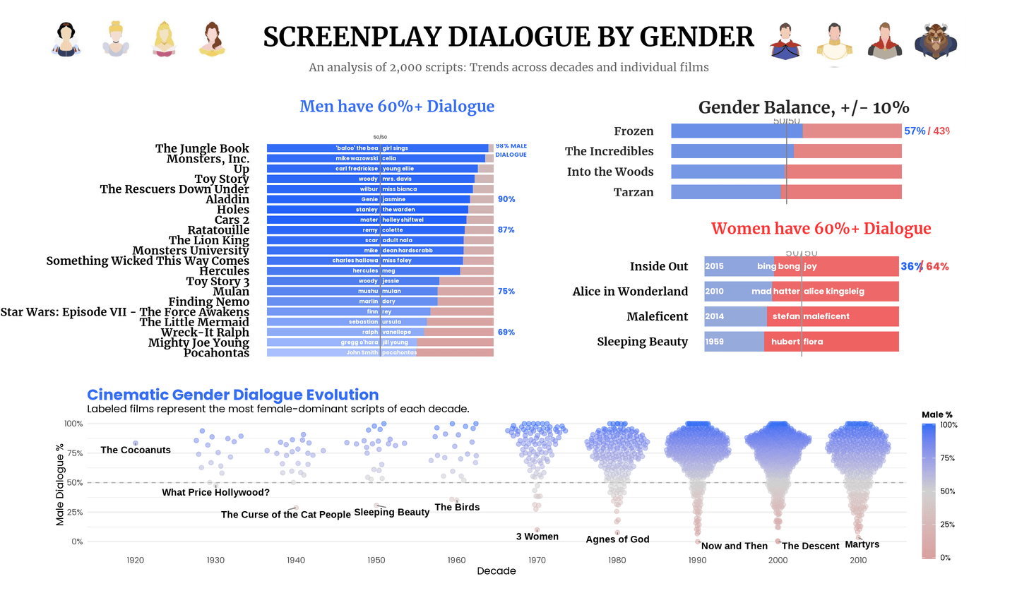
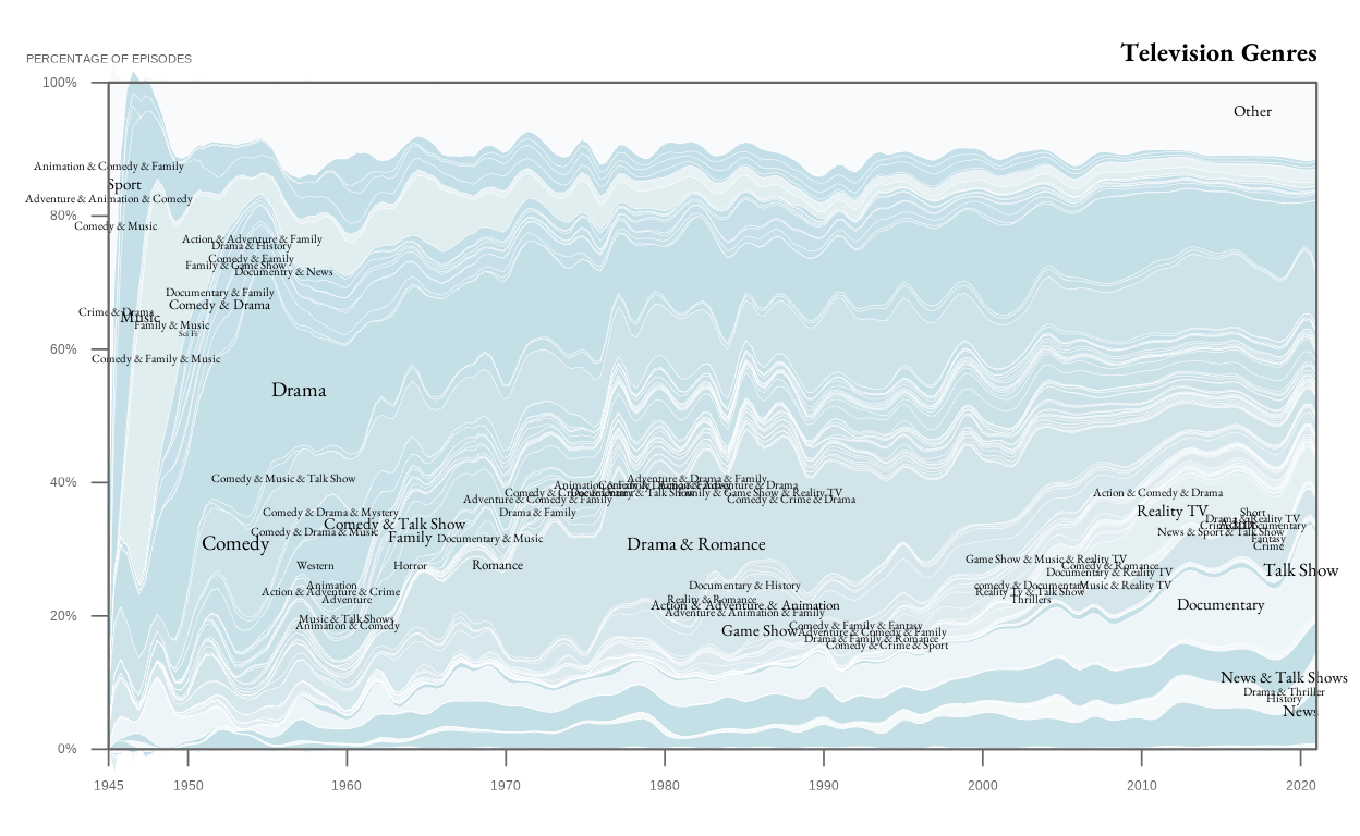
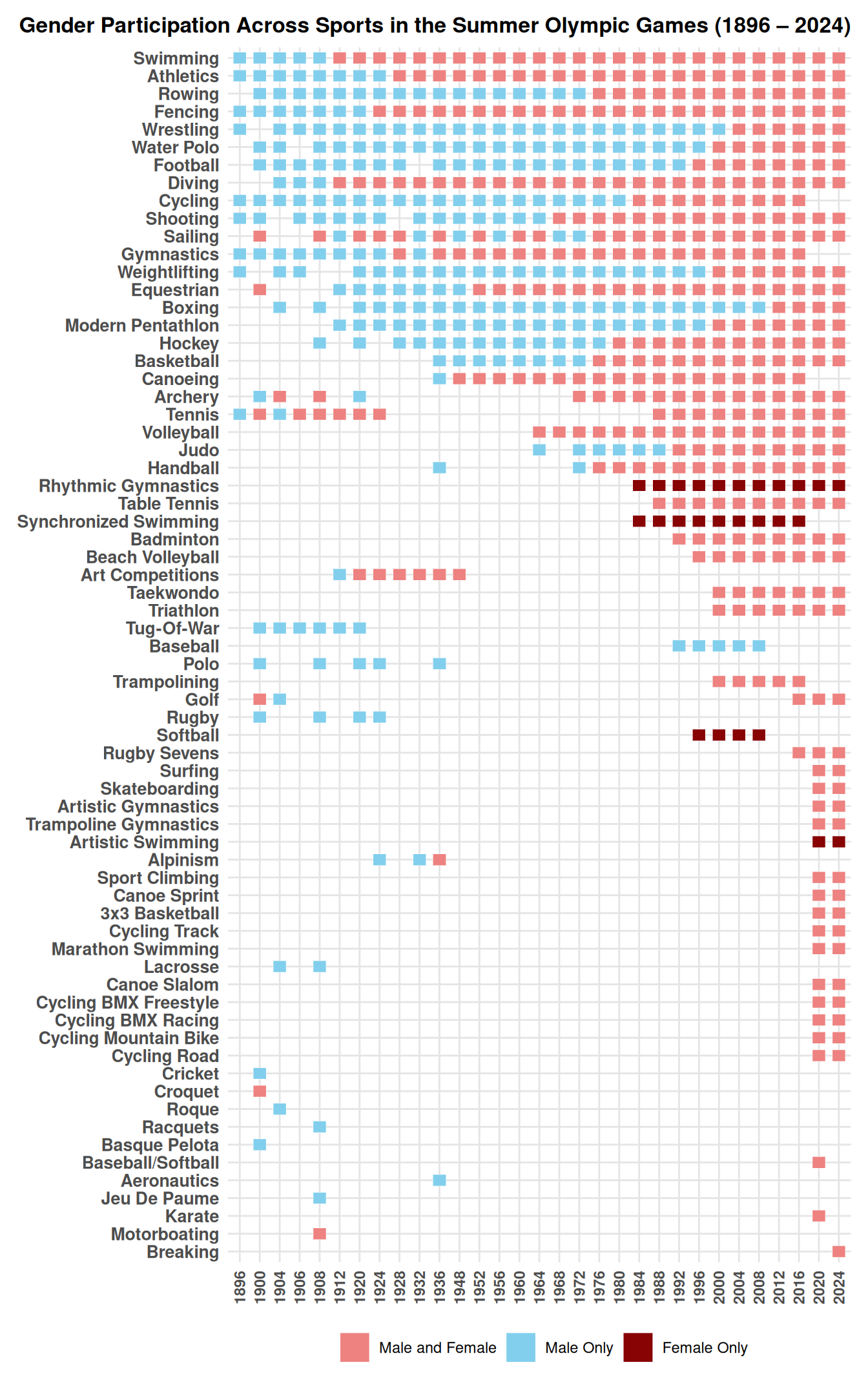
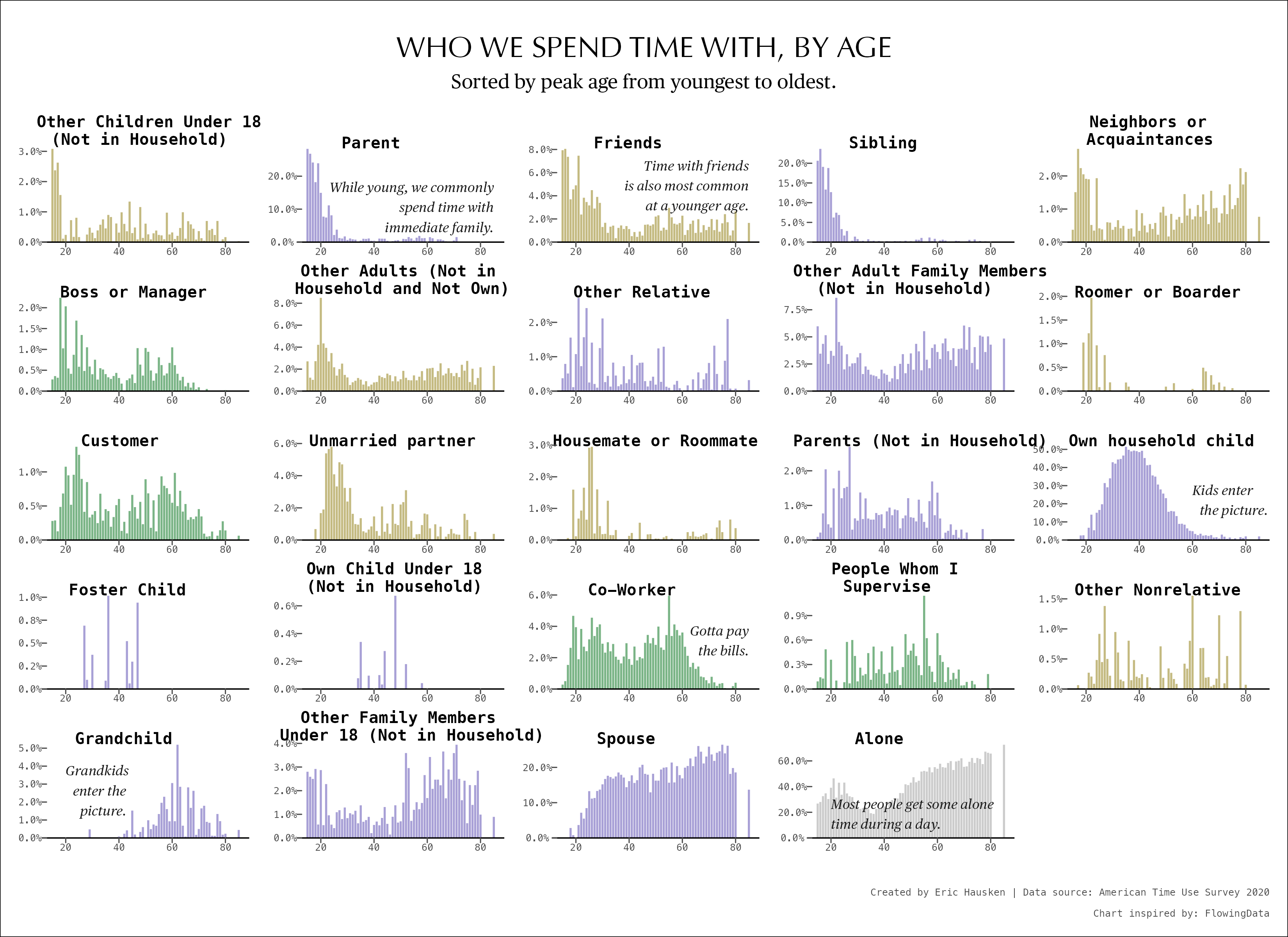
Film Dialogue: Screenplay Dialogue by Gender
2,000 Screenplays Dialogue Broken-down by Gender.
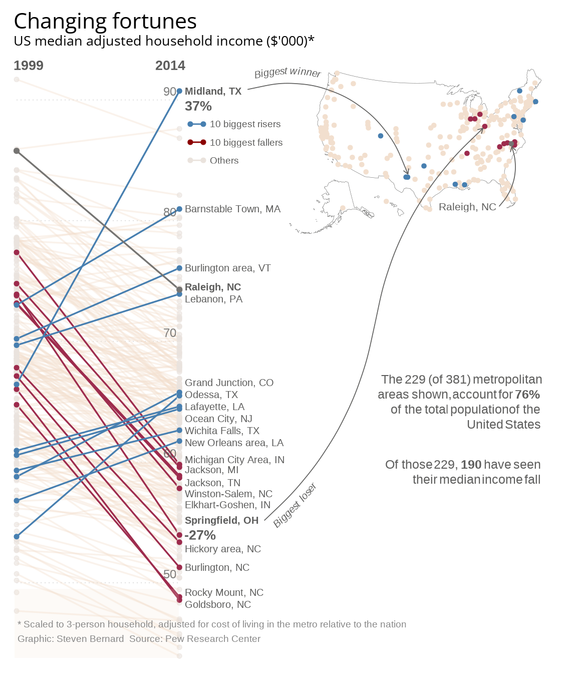
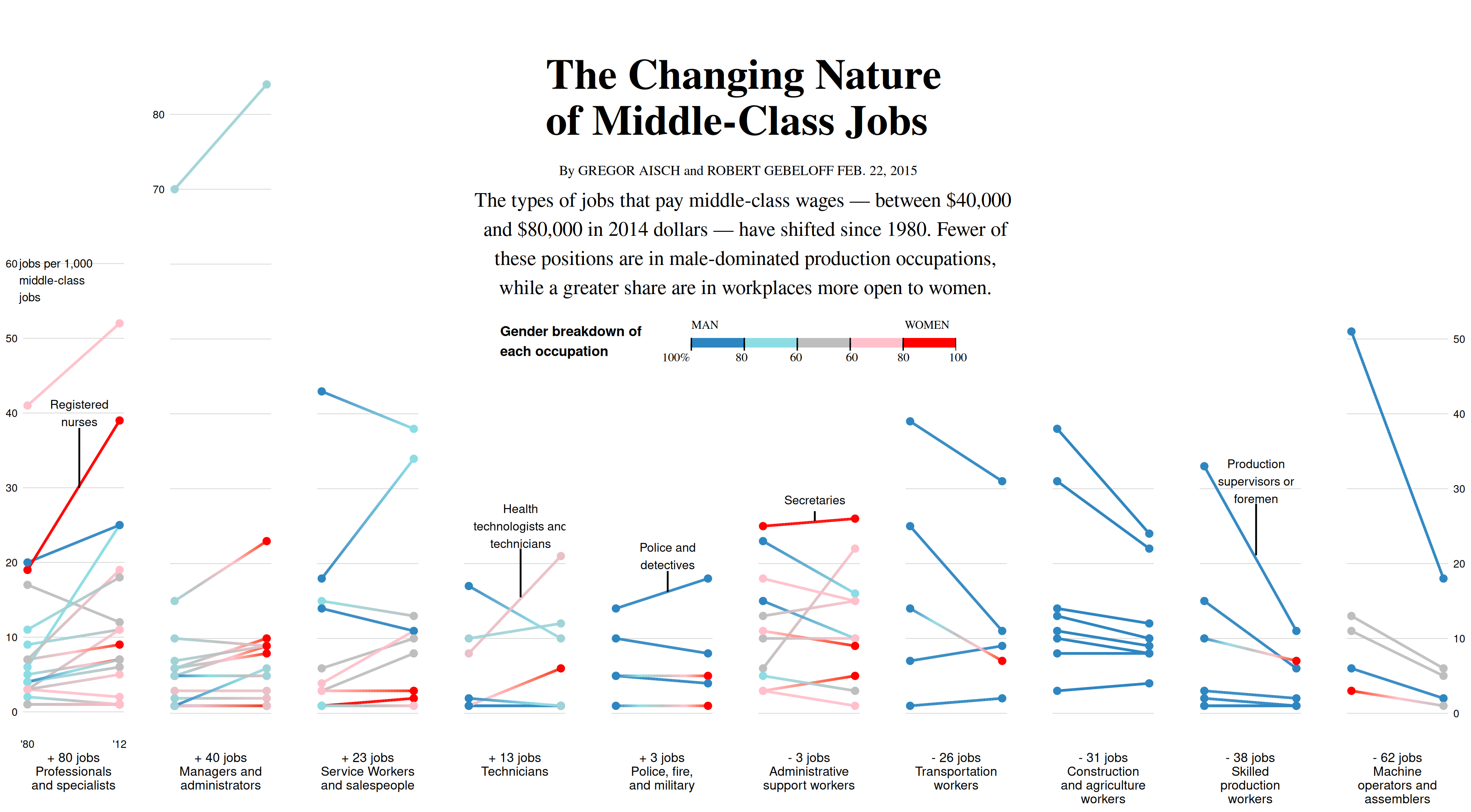
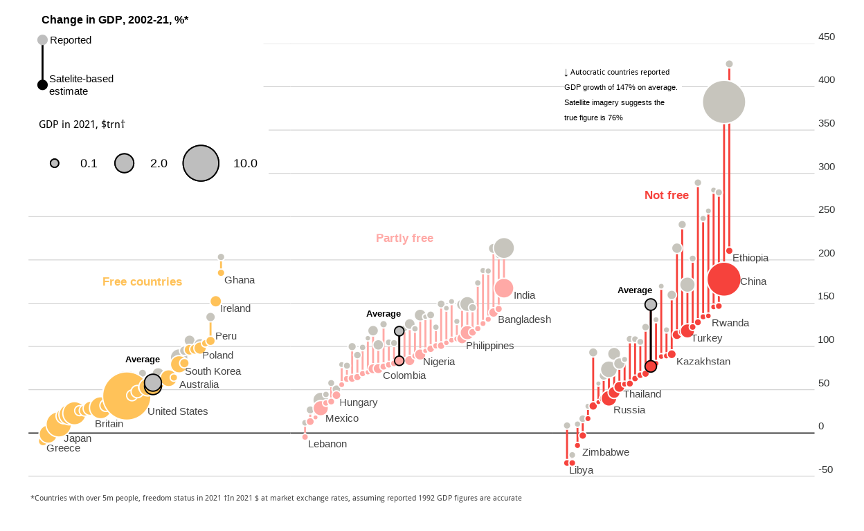
Changing Fortunes
Financial Times Graph Replication