Tutorials
01. Building Graphs Layer by Layer
This tutorial is a gentle introduction to ggplot2, one of the most successful software packages for producing statistical graphics, created by Hadley Wickham based on the "Grammar of Graphs" by Leland Wilkinson. It provides a simple set of core principles, with carefully chosen defaults, to enable quick prototyping as well as publication-quality graphics. In what follows, we will familiarize ourselves with the fundamental concepts and elements of every ggplot2 graphic: how to create a plot object, add data, create a mapping to some aesthetics, and add layers of visual marks.
02. Scales and Guides
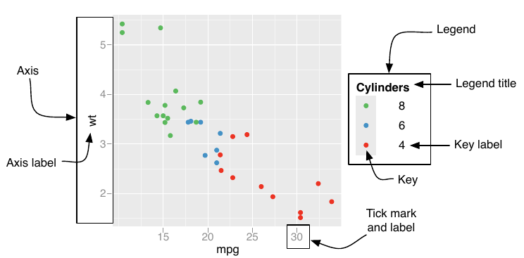
Scales are responsible for turning your mapping from data to aesthetics into something that you can see, and they also provide the guides that let you interpret the plot: axes and legends. Scales are automatically inferred based on the input data, and guides are added as well based on the layers in your plot, which is convenient and saves a lot of time. However, sometimes it is required to fine-tune how the mapping is performed, or how the guide should look like. This tutorial explores the tools available for this.

03. Coordinate Systems
The meaning of position aesthetics and how they produce a 2D position on the plot depend on the coordinate system. This is also responsible for drawing the axes and panel backgrounds (grid lines, etc.). As with scales, Cartesian coordinates are applied by default unless stated otherwise, which preserves the common meaning of x and y.
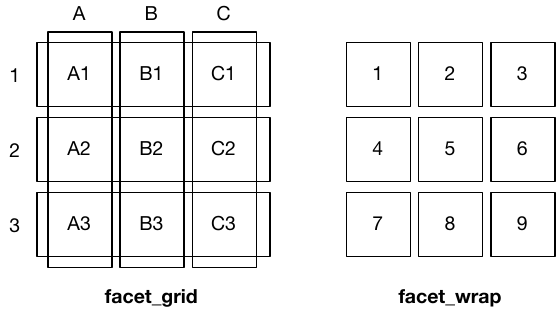
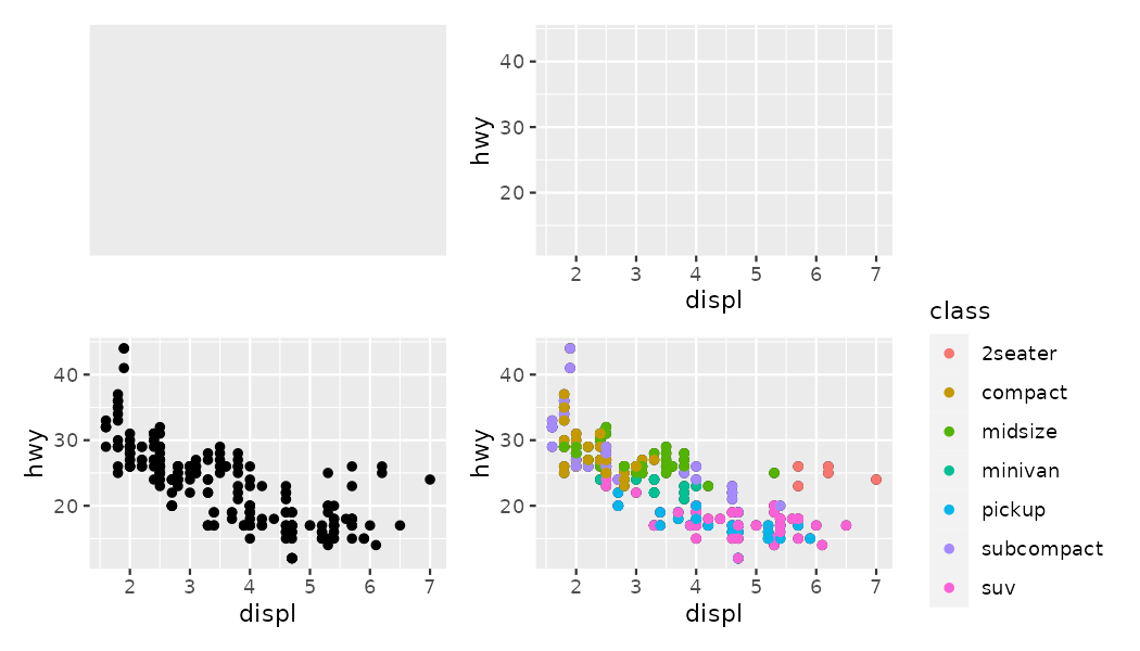
04. Faceting
Faceting is a way to trade off some discrete aesthetic (e.g. hue) for position. It generates multiple subsets of the data (filtered by the values of some typically categorical variable) and shows them side by side. In this tutorial, the three kinds of facets available are explored as well as how they interact with position scales.
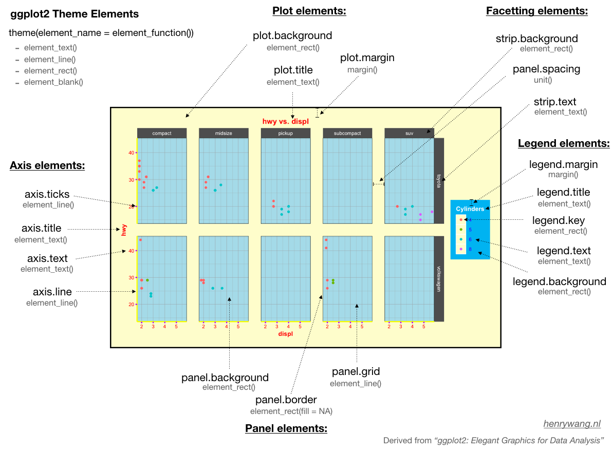
05. Themes
The final piece in the ggplot2 equation is theming. The powerful theme system does not affect any perceptual properties of the plot, but it help us make production-quality graphs through a fine control over things like fonts, ticks, panel strips, backgrounds...
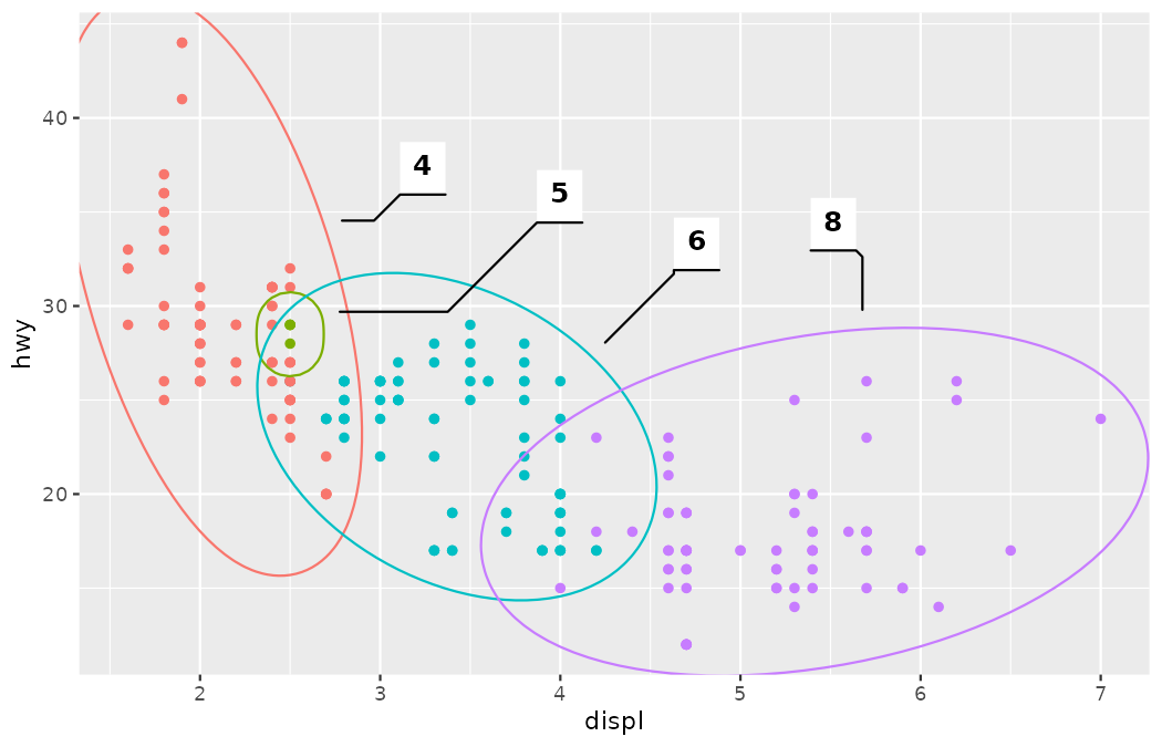
06. Annotations
When constructing a graph, it is often necessary to make annotations to the data displayed. Annotations provide the necessary context to direct the reader's attention and build an effective story. This metadata, as a form of data, will use the same geoms and tools that we already know. However, there are some helpers, in ggplot2 as well as other extension packages, that may be useful for certain special use cases.
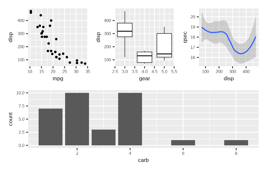
07. Arranging plots
The grammar presented so far is concerned with creating single plots. However, it is often necessary to assemble several different plots together in order to build a story. In this tutorial, we will learn to produce such arrangements in an automated manner without requiring external graphic design tools and non-reproducible manual work.
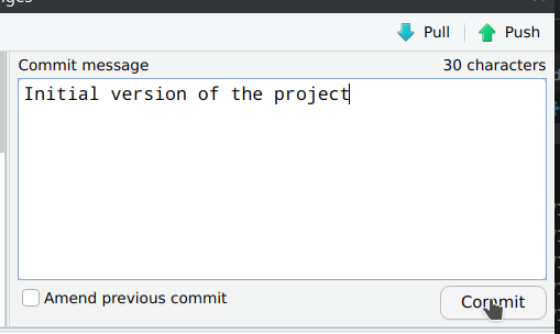
Creating and Submitting your Project
The course's final goal is to publish a visualization project in our website, where you are reading this tutorial. The website is an R Markdown project that lives in a GitHub repository. This tutorial will help you fork the repository, create a new draft for your project, and submit it using GitHub's Pull Request workflow.
