library(tidyverse)
library(corrplot)
library(sf)
library(leaflet)
library(rnaturalearth)

sysfonts::font_add_google("Playfair Display", family = "Playfair Display")
sysfonts::font_add_google("Arimo", family = "arimo")
showtext::showtext_auto()
Chosen graph

The graph I have chosen is a bar plot that shows the percentage of loneliness among elders in different countries, from Our World in Data, and it is part of an article that tries to prove and explain the importance that social connections and personal relationships have in our health.
Regarding the data gathering process to improve, enhance and do alternative visualizations, I had to download the CSV file that is available on the “Download” bottom tab of the above graph.
Initial graph replicated
#Open data set
worldsadness <- read_csv("self-reported-loneliness-older-adults.csv",
                          show_col_types = FALSE)  %>% dplyr::select(-Code)  %>%
                          dplyr::rename( Country = Entity)

worldsadness$Country <- factor(worldsadness$Country,
                               levels=c("Denmark","Switzerland", "Sweden",
                                        "United States", "England",
                                        "Netherlands","Germany", "Finland",
                                        "Spain", "Belgium","France", "Austria",
                                    "Italy","Israel", "Greece"))

#Graph
ggplot(worldsadness)+
  #establecer los ejes
  aes(x=Country, y= Sadness, fill=Country )+
  #quitar las etiquetas del eje x
  scale_x_discrete(NULL) +
  #specify a color for each bar
  geom_col( width = 0.75,#width of bars in relation to the x-axis
            fill = c("#4982C5",#Austria
                     "#C69F73",#Belgium
                     "#719461",#Denmark
                     "#E98473",#England
                     "#CA6B7D",#Finland
                     "#9A5057",#France
                     "#3B6334",#Germany
                     "#835CA2",#Greece
                     "#CA723A",#Israel
                     "#72B99E",#Italy
                     "#A96C4A",#Netherlands
                     "#274A74",#Spain
                     "#B06FAB",#Sweden
                     "#56B7C5",#Switzerland
                     "#B06FAB"#USA
                     ))+
  coord_flip()+
  theme_minimal()+
  #now texts content
  labs(y= NULL,
       title= "Self-reported loneliness among older adults",
        subtitle = "Share of survey respondents who report feeling lonely at least some of the time. For all countries estimates \n correspond to population ages 65+, except in the following cases: US (ages 72+); UK (ages 65-74); and \n Finland (ages 75+).",
       caption = "Source: Our World in Data based on Sundström et al. (2009), Savikko et al (2005), ONS (2019) and CIGNA (2018)\nNote: Estimates correspond to people who report feeling lonely \"some of the time\", \"most of the time\", or \"almost all the\n time\". This is in contrast to those that report feeling lonely \"rarely\", \"almost none of the time\", or \"never\".\nCC BY")+
  #now texts characteristics
  theme(
    plot.title = element_text(size=32, family = "Playfair Display",
                              color = "#555555"),
    plot.subtitle = element_text(size=18, family = "arimo", color = "#555555",
                                 lineheight = 0.8, margin= margin(0,0,20,0)),
    plot.caption = element_text(size = 15, family = "arimo", color = "#555555",
                                lineheight = 0.7,  margin= margin(10,0,0,0)))+
  #now text position
  theme(plot.title.position = "plot")+
  theme(plot.subtitle = element_text(hjust = 0))+
  theme(plot.caption =  element_text(hjust = 0))+
  theme(plot.caption.position = "plot")+
  #add label at the end of the bar
  geom_text(aes(label = paste(Sadness, Year, sep= "% in ")), vjust = 0.7,
            hjust=-0.1, colour = "#555555", size= 6, family= "arimo")+
  #change the grid
  theme(panel.grid.major.x = element_line(color = "lightgrey",
                                          size = 0.4, linetype = 2))+
  theme(panel.grid.minor.x = element_blank())+
  theme(panel.grid.major.y = element_blank())+
  #ticks del eje y bien puestos
  scale_y_continuous(limits = c(0,70),
                     labels = c("0%","10%","20%","30%","40%","50%","60%"),
                     breaks = c(0,10,20,30,40,50,60))+

   #both axis text characteristics modified
  theme(axis.text.x = element_text(size = 20, family = "arimo",
                                   color = "#555555"))+
  theme(axis.text.y = element_text( size = 17, family = "arimo",
                                    face = "bold", color = "#555555",
                                    hjust=1, vjust= 0.5))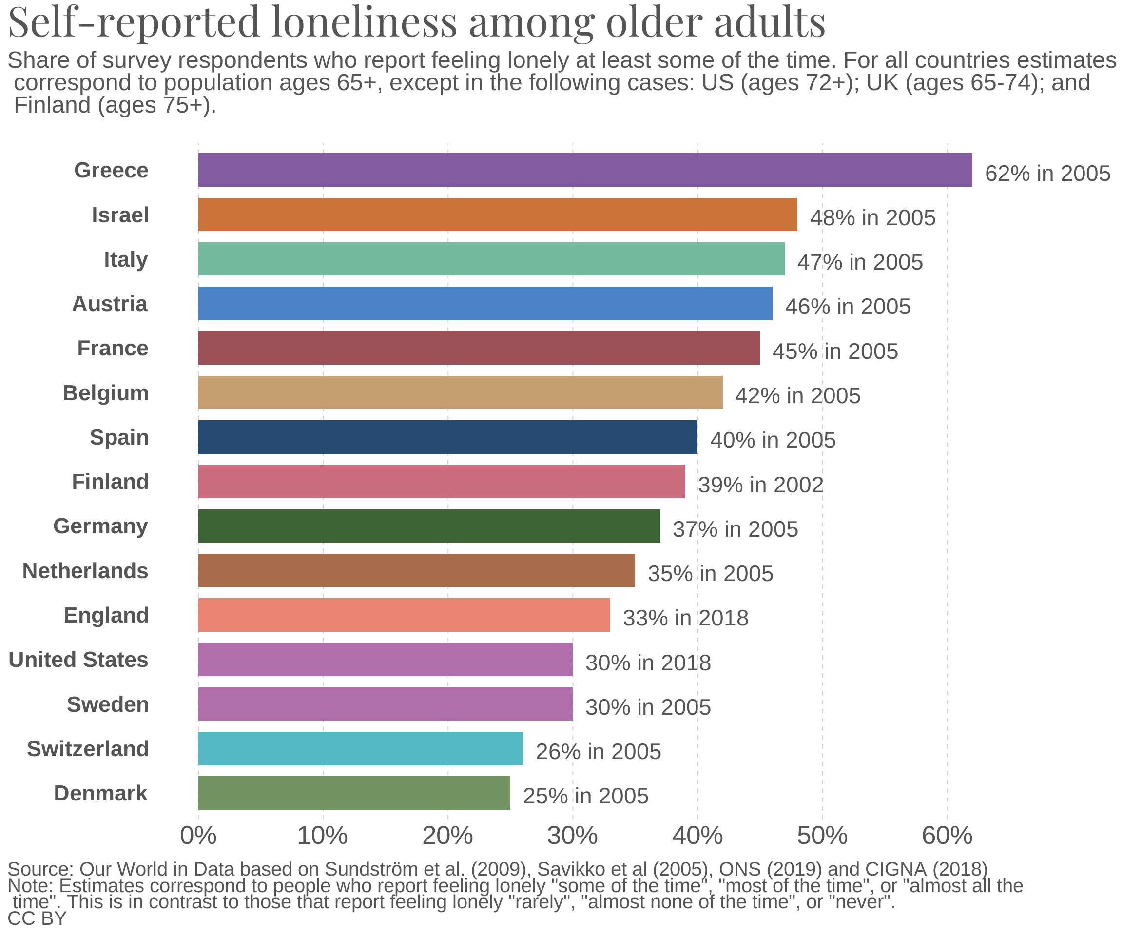
On one hand, this visualization has two main weaknesses, the first and most obvious one is the use of colors inside bars, because it seems randomly chosen and it is non-informative. And at the same time, the visualization has too many text explaining information displayed on the graph, like the difference among countries regarding year of data collection and respondents age.
On the other hand, as a strength, the hierarchical bars position is truly informative, because we can easily see that Greece is the country with the highest percentage of loneliness among elders, while Denmark has the lowest, and the rest of the countries are positioned following that hierarchy.
Initial graph enhanced
#above code chunk to extend graph height, and make it longer

#Open data set
worldsadness2 <- read_csv("remake2-self-reported-loneliness-older-adults.csv",
                          show_col_types = FALSE)  %>% select(-Code)  %>%
                          rename( Country = Entity)

worldsadness2$Country <- factor(worldsadness2$Country,
                               levels=c("Denmark","Switzerland", "Sweden",
                                        "United States", "England",
                                        "Netherlands","Germany", "Finland",
                                        "Spain", "Belgium","France", "Austria",
                                        "Italy","Israel", "Greece"))
worldsadness2$Age <- factor(worldsadness2$Age,
                               levels=c("65+", "65-74", "72+", "75+"))
#Graph
ggplot(worldsadness2)+
  #establecer los ejes
  aes(x=Country, y= Sadness, fill= Age)+
  geom_col(width = 0.75)+#width of bars in relation to the x-axis
  coord_flip()+
  #the legend characteristics
  scale_fill_manual(name = "Respondents age and \n data collection year",
                      labels = c("65+ & 2005",
                                 "65-74 & 2018",
                                 "72+ & 2018",
                                 "75+ & 2002"),
                      values = c("#BEBEBE",#Austria and all
                                "#4169E1",#England
                                "#A020F0",#USA
                                "#2E8B57"))+#Finland
  theme(legend.position = c (.8,.4))+
  theme(legend.title =  element_text(size = 8, family = "Playfair Display",
                                     hjust=0.4))+
  theme(legend.text =  element_text(size = 7, family = "Arimo"))+
  #quitar las etiquetas del eje x
  scale_x_discrete(NULL)+
  #remove the grid
  theme(panel.grid.major = element_blank(), panel.grid.minor = element_blank(),
  panel.background = element_blank())+

  #now texts content
  labs(y= NULL,
       title= "Self-reported loneliness among older adults",
       subtitle = "Percentage of respondents who reported feeling lonely \"some of the time\",\"most of the time\", or \"almost \nall the time\", contrary to those who reported feeling lonely \"rarely\", \"almost none of the time\" or\"never\".",
       caption = "Source: Our World in Data based on Sundström et al. (2009), Savikko et al (2005), ONS (2019) and CIGNA (2018)")+
  #now texts characteristics
  theme(
    plot.title = element_text(size=17, family = "Playfair Display",
                              color = "black"),
    plot.subtitle = element_text(size=9, family = "Arimo", color = "#555555",
                                 lineheight = 0.9, margin= margin(0,0,10,0)),
    plot.caption = element_text(size = 7, family = "Arimo", color = "#555555",
                                lineheight = 0.5, margin= margin(10,0,0,0)))+
  #now text position
  theme(plot.title.position = "plot")+
  theme(plot.subtitle = element_text(hjust = 0))+
  theme(plot.caption =  element_text(hjust = 0))+
  theme(plot.caption.position = "plot")+
  #add label at the end of the bar
  geom_text(aes(label = paste(Sadness, "%", sep = "")), vjust = 0.7, hjust=-0.1,
            colour = "#555555", size= 3, family= "Arimo")+
    #ticks del eje y bien puestos
  scale_y_continuous(limits = c(0,70), labels = c("","","","","", "",""),
                     breaks = c(0,10,20,30,40,50,60))+
   theme(axis.ticks.y = element_blank())+
  theme(axis.ticks.x =  element_blank())+
  #both axis text characteristics modified
  theme(axis.text.x = element_text(size = 10, family = "Arimo",
                                   color = "#555555"))+
  theme(axis.text.y = element_text(size = 9, family = "Arimo", face = "bold",
                                   color = "#555555", hjust=1, vjust= 0))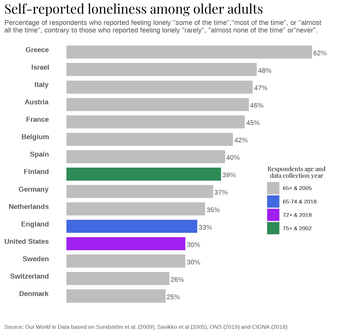
In order to enhance the chosen graph I worked on the weakness and took advantage of its strength.
As color was the main problem, I changed the color of the bars to make color informative about the differences between countries in relation to respondents age and data collection year. To do so, I used grey as baseline, and three different colors: green, purple and blue, to show that most of the countries had the same year of data gathering and respondents age, but there are three countries that differ from the rest. That is why I used four different colors, to remark that difference, even though using a color hue would have been more aesthetically pleasing.
Therefore, this bars color difference and the legend that explains them, allowed me to remove text from the graph subtitle and caption. I have just kept information about how the data gathering process took place, and moved it from the caption to the subtitle, besides, I have kept the graph reference in the caption. Furthermore, the color legend also allowed me to remove the data gathering year from the end of the bars next to the loneliness proportion. Thus, the enhanced graph has just the concrete percentage of loneliness next to the bar, in order to make it clearer and easier to spot and compere that data.
Moreover, the x axes percentages have been removed because as I have mentioned, the hierarchical position of bars is already informative about how the loneliness percentage varies among the different countries. And at the same time, the percentage labels at the end of the bars provide the concrete differences, therefore, there is no need for percentages from 0% to 60% to appear in the x axis, because it is repeating information that is already in the graph.
Alternative visualization of the graph
The graph shows a ranking categorical variable, thus, alternative visualizations such as lollipop chart, a radar chart or a wordcloud where considered, but they did not have any advantage compared to the bar plot.
Hence, as the categorical variables are country names, and 13 out of 15 are Europe countries, I decided to plot the Europe map and add the information about Israel and United States as a reference.
However, one of those countries is England and I really struggled to find a Europe map data that included England as a country, until I reread the documentation of the graph and realized they were talking about data gathered in United Kingdom, besides the fact that the label on the chosen graph to represent this data, was England. Therefore, from now on the territory represented is United Kingdom and not England.
Choropleth map
#The data
worldsadness3 <- read_csv("map-self-reported-loneliness-older-adults.csv",
                          show_col_types = FALSE)  %>% select(-Code)  %>%
                          rename( Country = Entity)
#The map
world <- ne_countries(scale = "medium", returnclass = "sf")
Europe <- world[which(world$continent == "Europe"),]
#To join the data frames, map and data
mapdata<- Europe %>% left_join(worldsadness3, by = c("admin" = "Country"))
#data as map
mapdata <- st_as_sf(mapdata)
# Project the map data into a different coordinate system
mapdata <- st_transform(mapdata, crs = "+proj=longlat +datum=WGS84")
#The graph
 ggplot(mapdata) +
  geom_sf(aes(fill= Sadness),color = "white",
          linetype = 1,
          lwd = 0.25) +
  coord_sf(xlim = c(-15,50), ylim = c(35,73), expand = FALSE)+
#Without grid
  theme_void()+
#scale color and legend
   scale_fill_gradient(low="yellow", high ="red", limits = c(20,70), name=NULL,
                      labels = c("30%","40%", "50%","60%"),
                      breaks = c(30,40,50,60),
                      guide = guide_colourbar(reverse = TRUE))+
#now texts content
labs(
     title= "Percentage of elders \n feeling sad",
     subtitle= "Other countries: \n USA 30% \n Israel 48%",
     caption = "Displayed respondents reported feeling lonely \"some of the time\",\n \"most of the time\", or \"almost all the time\", contrary to those who \n reported feeling lonely \"rarely\", \"almost none of the time\" or \"never\"\n \n Source: Our World in Data based on Sundström et al. (2009), Savikko et al (2005), ONS (2019) and CIGNA (2018)")+
#now texts characteristics
  theme(
    plot.title = element_text(size=19, family = "Playfair Display",
                              color = "black", lineheight = 0.9),
    plot.subtitle = element_text(size = 9, family = "public sans",
                                 color = "#555555",
                                 lineheight = 0.8, margin= margin(10,0,0,0)),
    plot.caption = element_text(size = 8, family = "public sans",
                                color = "#555555",
                                lineheight = 0.8, margin= margin(10,0,0,0)))+
  #now text position
  theme(plot.title.position = "plot")+
  theme(plot.title = element_text(hjust = 0.5))+
  theme(plot.caption =  element_text(hjust = 0.5))+
  theme(plot.caption.position = "plot")+
  theme(plot.subtitle = element_text(hjust = 1))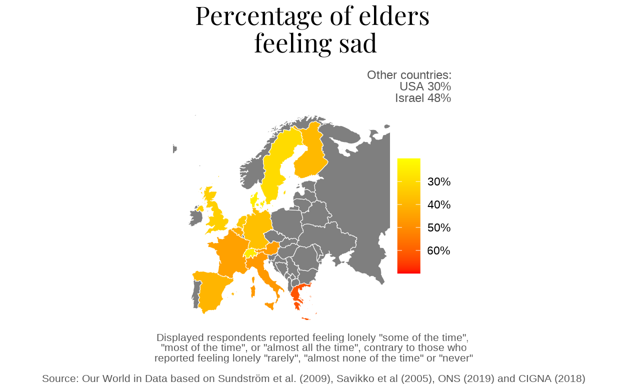
A choropleth map is an eye catching visualization that allows to get a general idea about the information displayed with just one look. That is due to the fact that size and position inform about the country, and the heat map color gradient chosen represent the increasing percentage of sadness among countries being yellow the lowest, orange the middle one and red the highest.
Nevertheless, if we compare this map to the enhanced graph, a lot of information has been dropped: the concrete percentage of loneliness for each country, the data collection year and the age of the respondents.
As a consequence, I decided to do an interactive map, which will keep all the choropleth map advantages, and at the same time, will display information about the country name, the concrete percentage, the data collection year and the age of the respondents, when moving the pointer over the map.
Interactive map
#The data
worldsadness4 <- read_csv("map-self-reported-loneliness-older-adults.csv",
                          show_col_types = FALSE)%>%
                          select(-Code)  %>%
                          rename( Country = Entity)
#The map
world <- ne_countries(scale = "medium", returnclass = "sf")
Europe <- world[which(world$continent == "Europe"),]
#To join the data frames, map and data
mapdata<- Europe %>% left_join(worldsadness4, by = c("admin" = "Country"))
#data as map
mapdata <- st_as_sf(mapdata)
# Project the map data into a different coordinate system
mapdata <- st_transform(mapdata, crs = "+proj=longlat +datum=WGS84")
#ANIMATED GRAPH
#Color gradient another function,
color_gradient2 <- colorNumeric(c("white", "yellow",
"red", "darkred"), 1:65)
my_colors3 <- color_gradient2(mapdata$Sadness)
#labels content
mylabels <- paste(ifelse(is.na(mapdata$name), "", mapdata$name), "<br/>",
                  ifelse(is.na(mapdata$Sadness), "", paste(mapdata$Sadness,"%")),
                  "<br/>",ifelse(is.na( mapdata$Year), "",
                  paste("Data collection:", mapdata$Year)), "<br/>",
                  ifelse(is.na(mapdata$Age), "",
                         paste("Respondents age:", mapdata$Age)))%>%
  lapply(htmltools::HTML)
#title and reference
htmltitle <- "<h5> <b> Percentage of elders feeling sad <b> </h5>"
EEUU <- "<h5> USA 30%  <br /> Data collection: 2018 <br /> Respondents age: 72+
</h5>"
Israel <- "<h5> Israel 48% <br /> Data collection: 2005 <br /> Respondents age:
65+ </h5>"

#THE GRAPH
leaflet(mapdata) %>%
  setView( lat=55, lng=20 , zoom=3)%>%
  addPolygons(
    fillColor = my_colors3,
    stroke = TRUE,
    color = 'White',
    weight = 1.5,
    label = mylabels,
    labelOptions = labelOptions(
      style = list("font-weight" = "normal", padding = "3px 8px"),
      textsize = "13px",
      direction = "auto")) %>%

  addLegend(
            position = "bottomright",
            pal= color_gradient2,
            values = ~mapdata$Sadness,
            na.label = "No data",
            opacity = 0.4,
            labFormat = labelFormat(suffix="%"),
            title = "") %>%
  addControl(html=Israel, position = "topright") %>%
  addControl(html=EEUU, position = "bottomright") %>%
  addControl(html=htmltitle, position = "topleft")