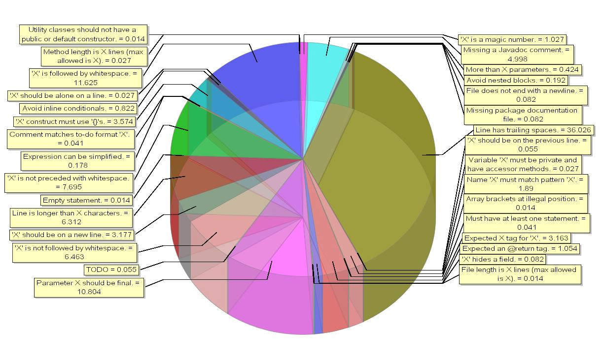
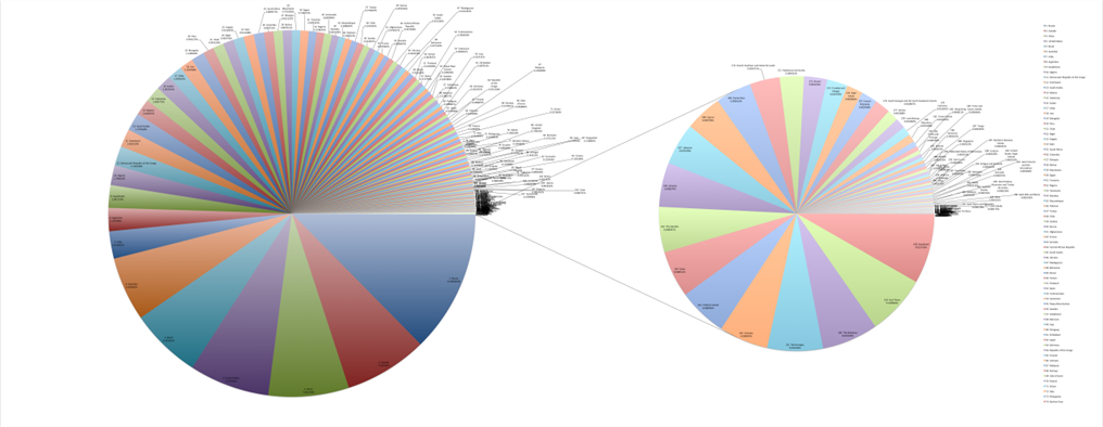
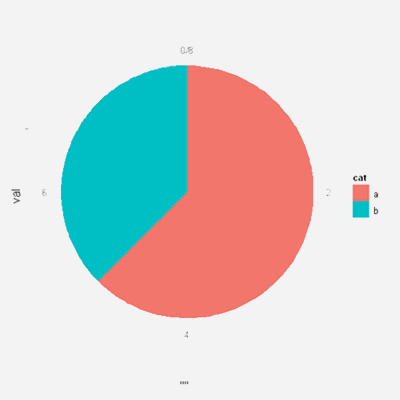
Prologue: Pie Charts
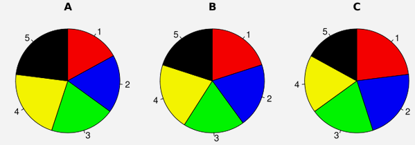
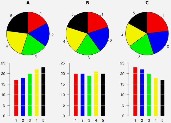

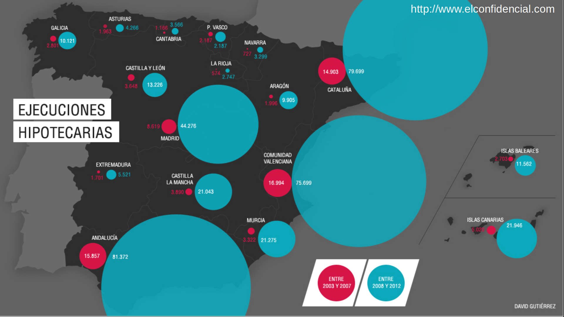
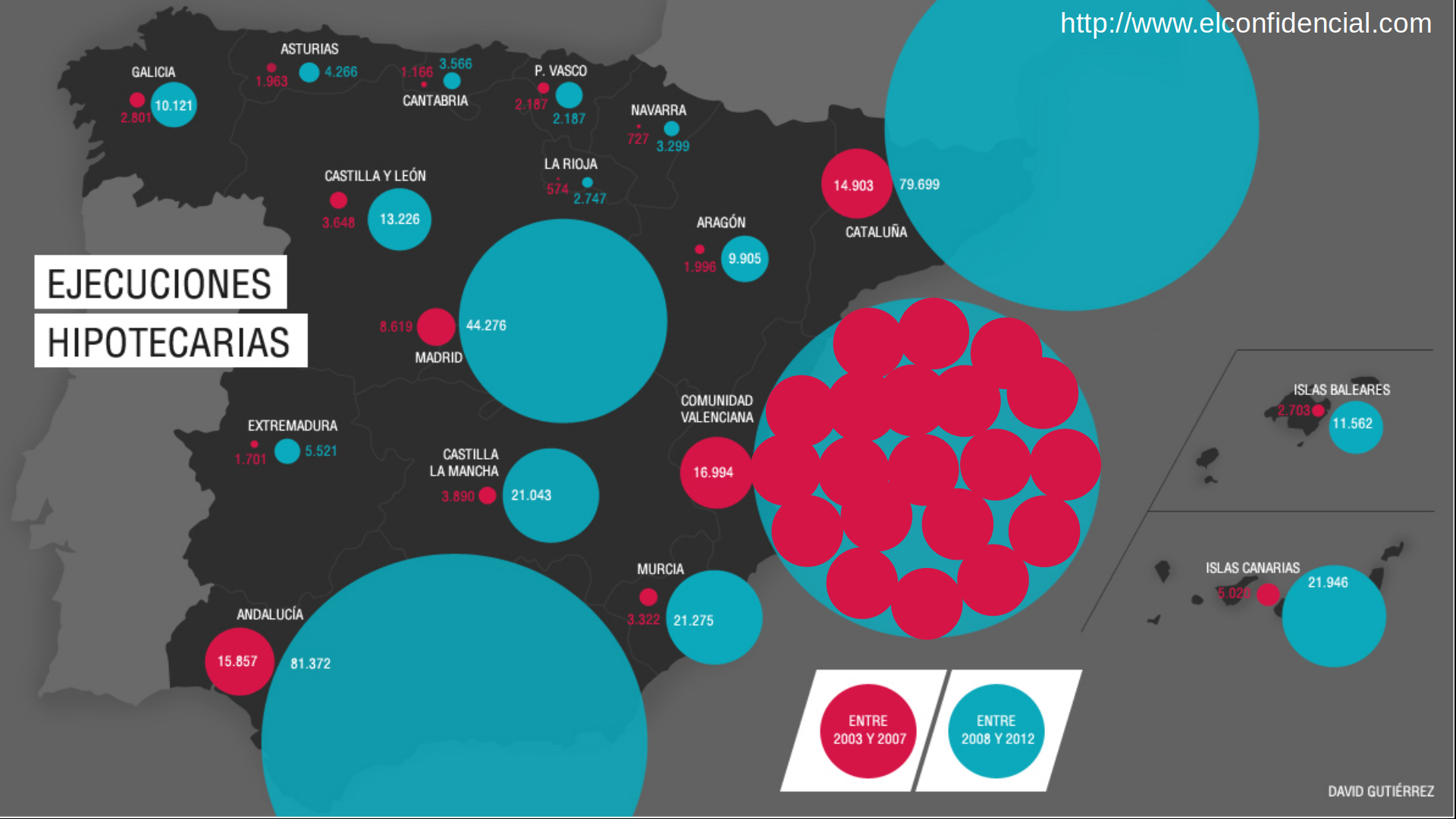
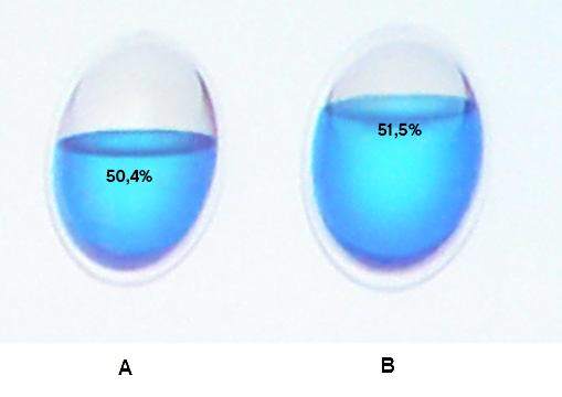
Bad Representation: Areas
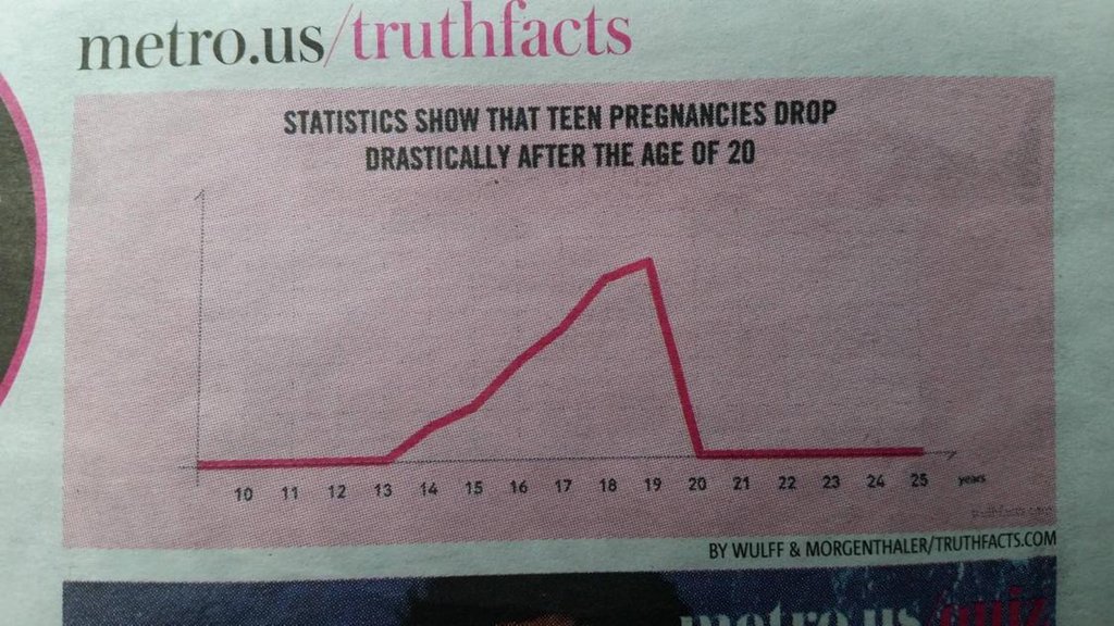
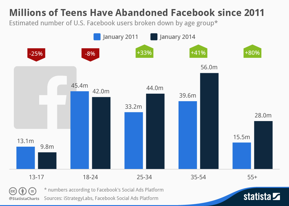
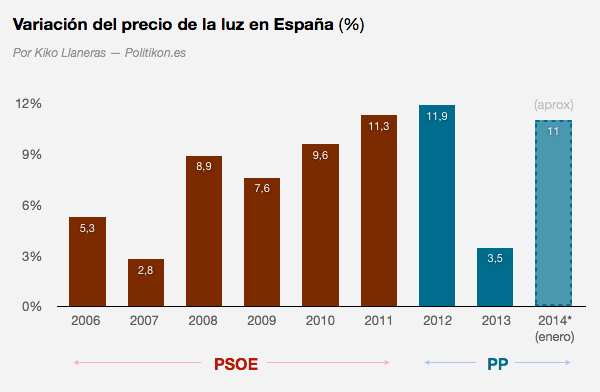
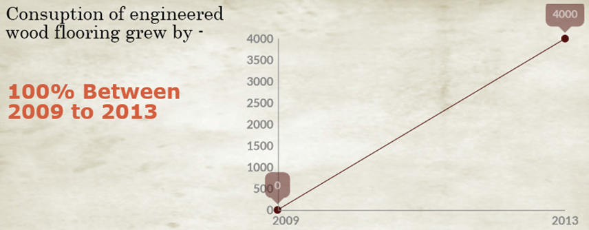
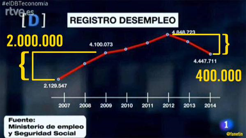
Bad Representation: Longitudes
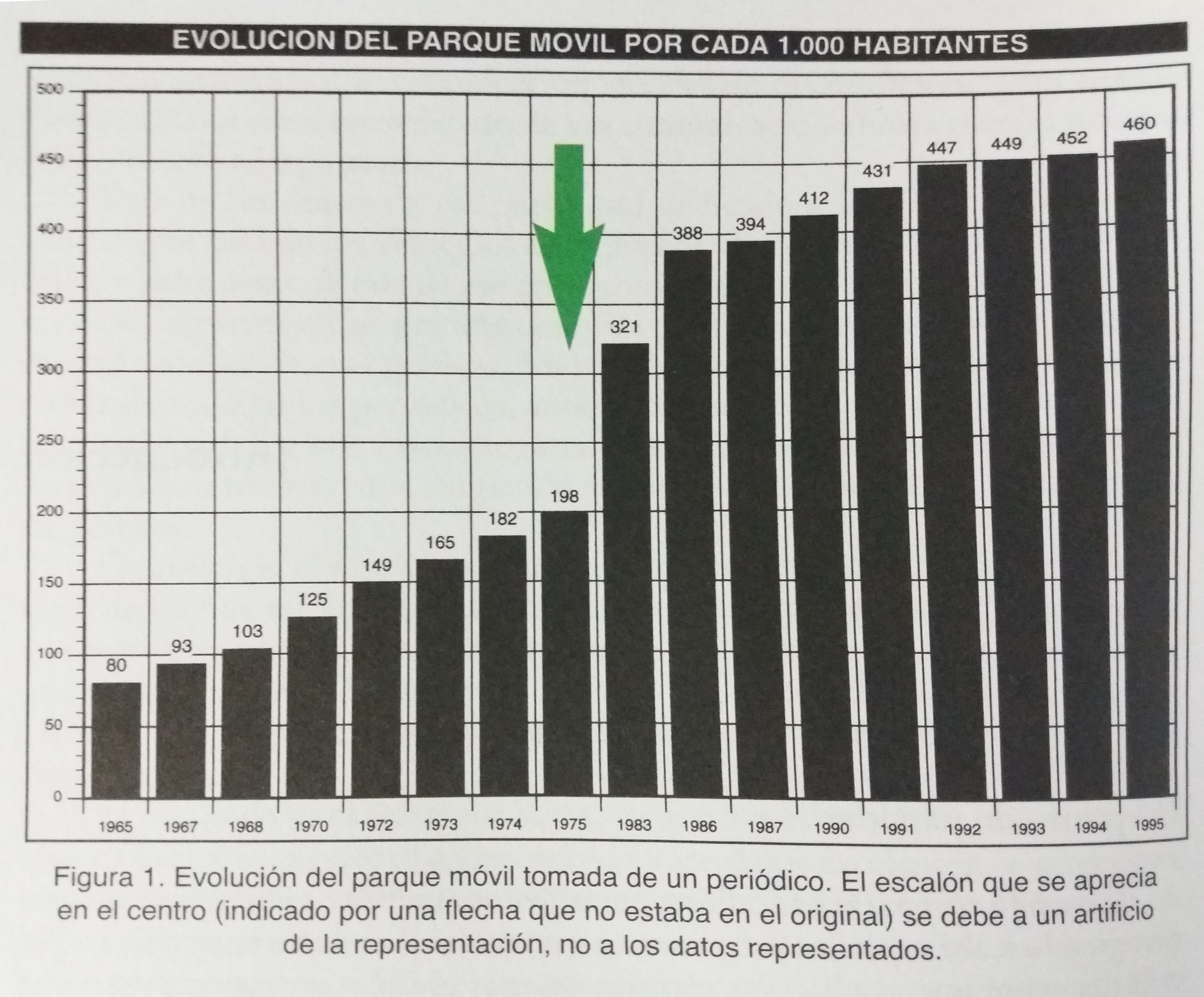
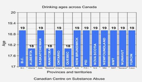
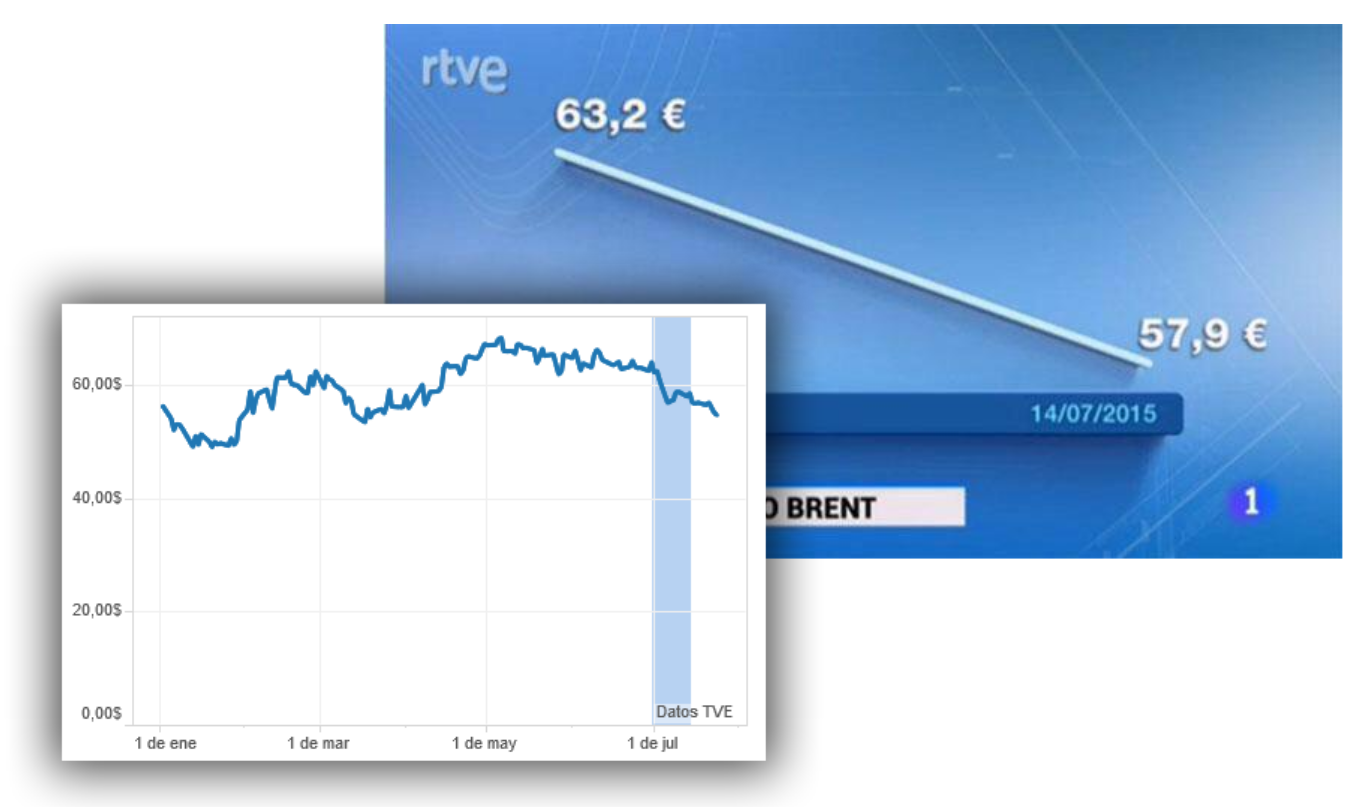
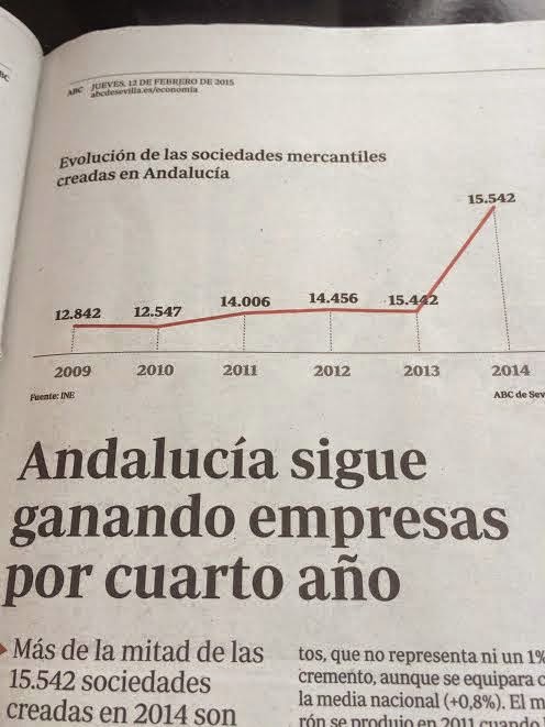
- Cutting the origin is the most common deception technique with bar plots
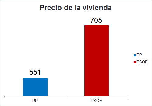


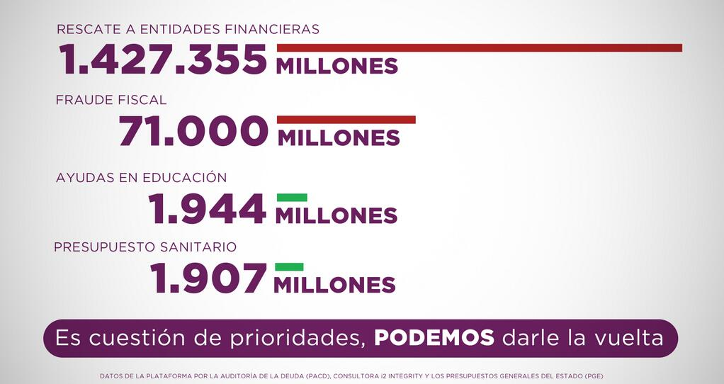
- Some well-intentioned axis cuts may have nefarious consequences
Bad Data
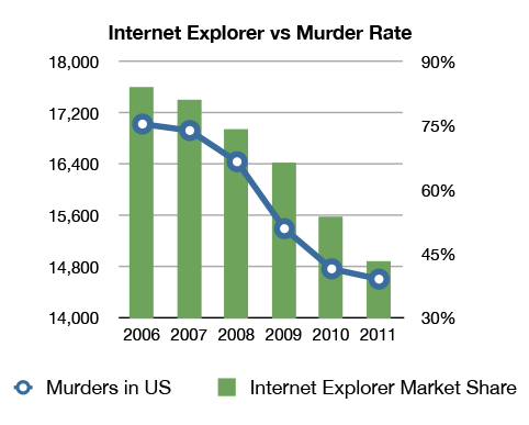
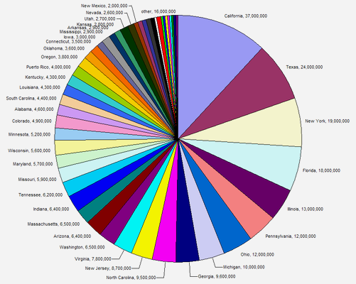
Too Many Data
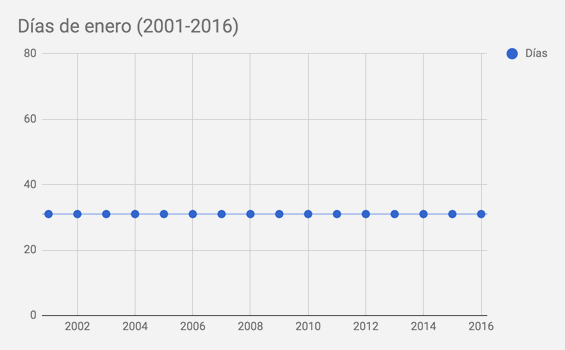
Too Little Data
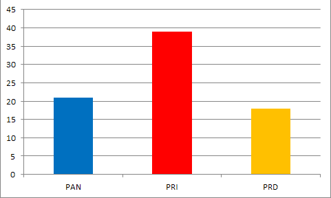
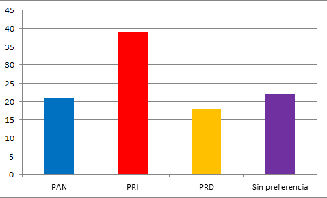
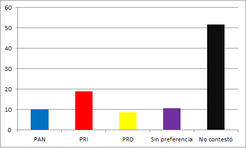
Hiding Relevant Data


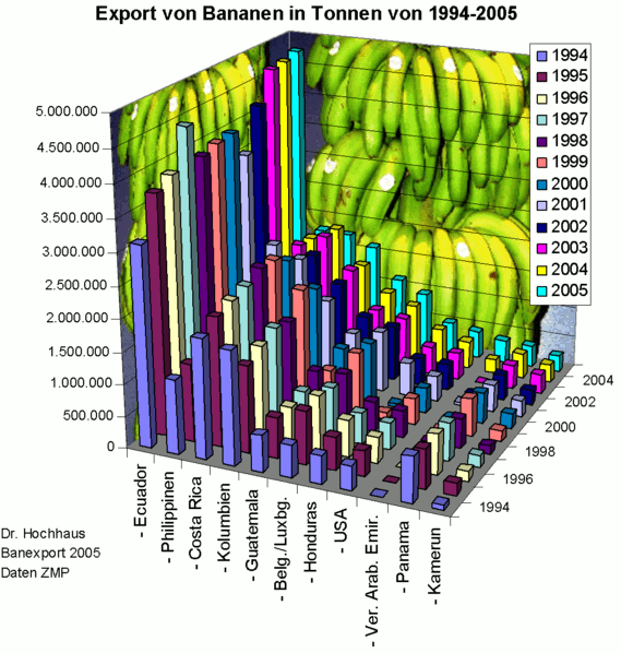
Bonus: Scientific Horrors
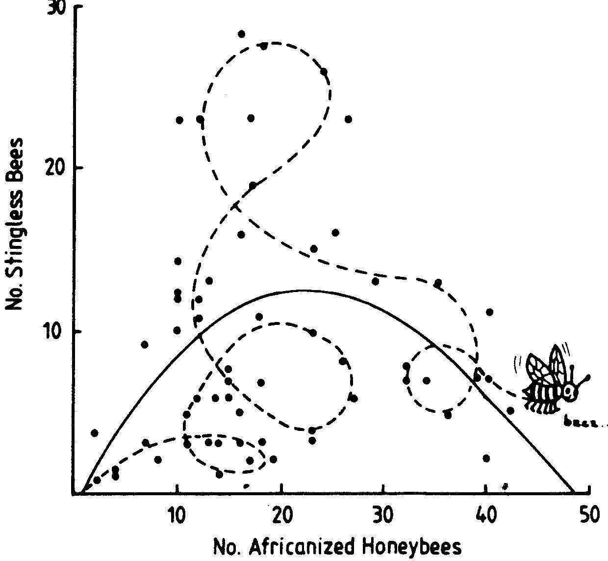
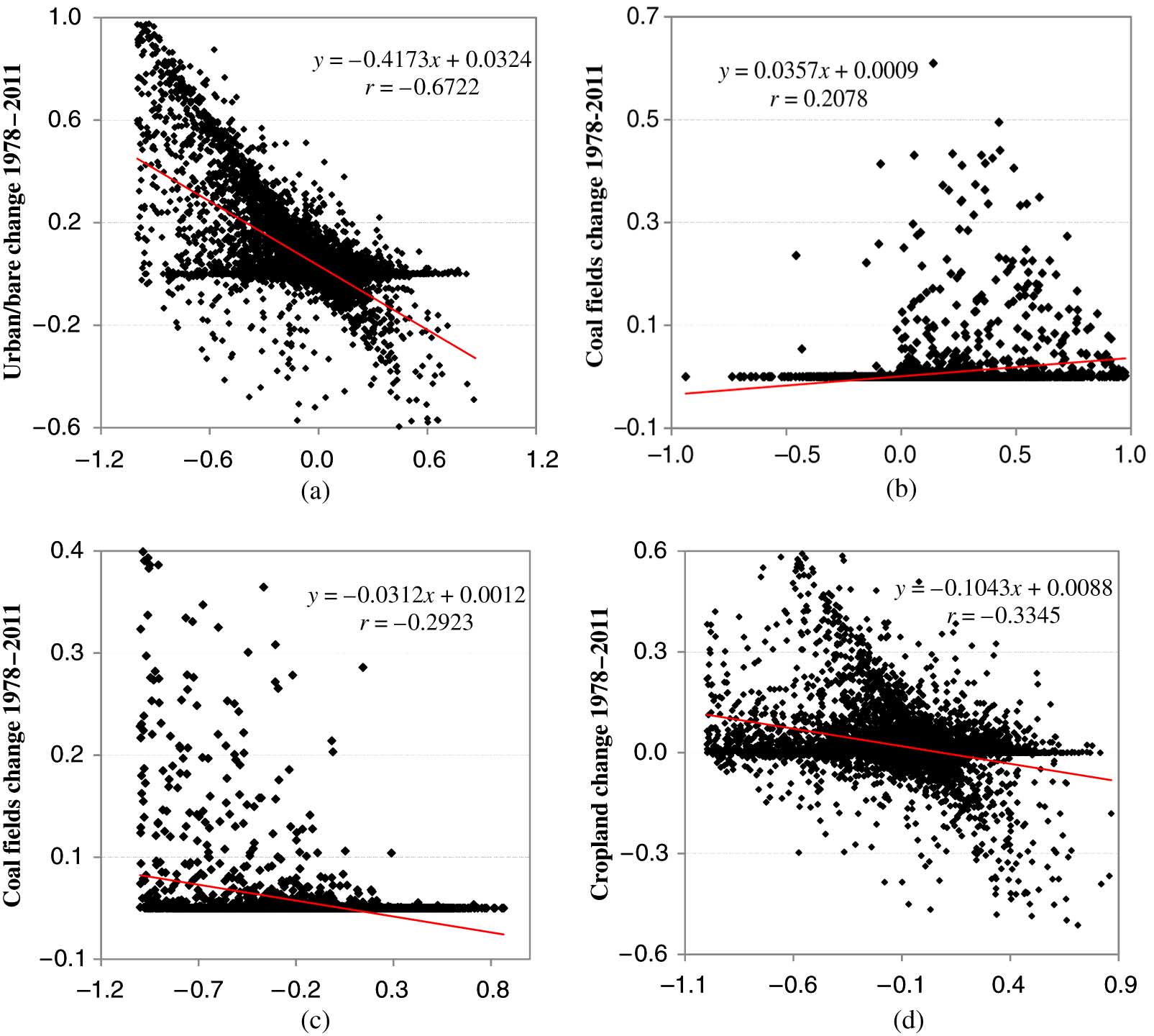


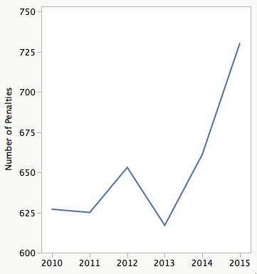
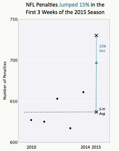


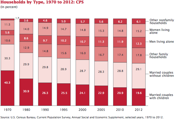
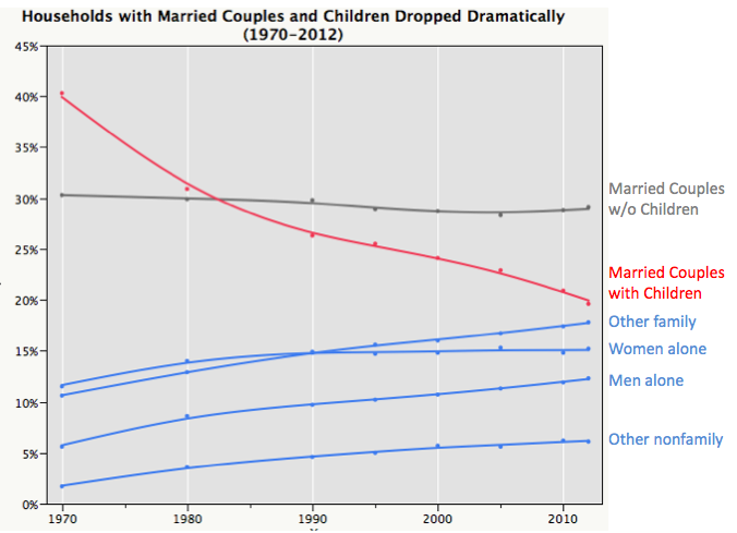
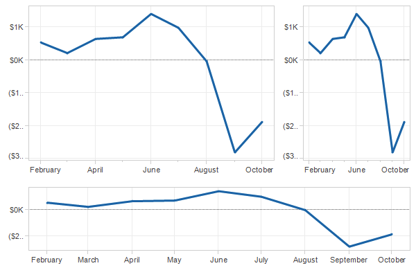
Chart Rethinking: Exercise 6
Schwabish, J. A. (2014). An Economist’s Guide to Visualizing Data
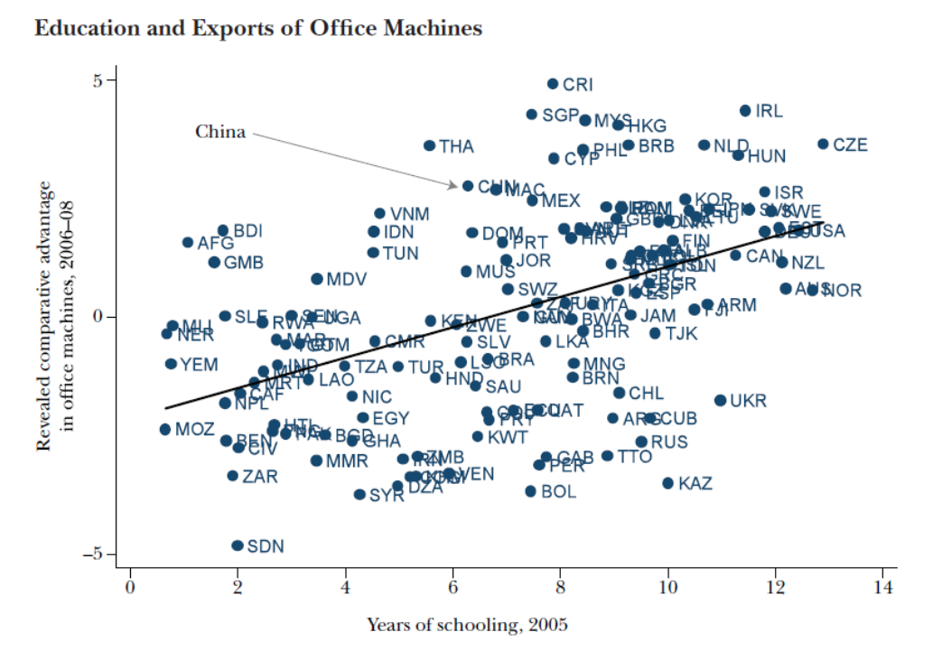
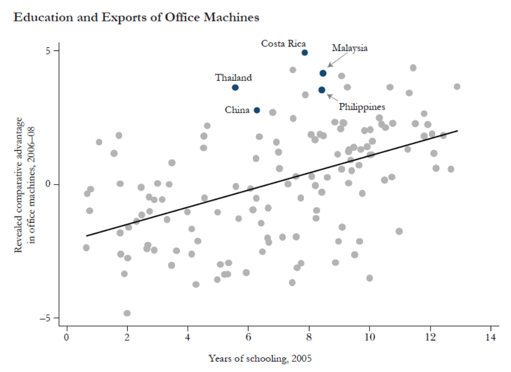
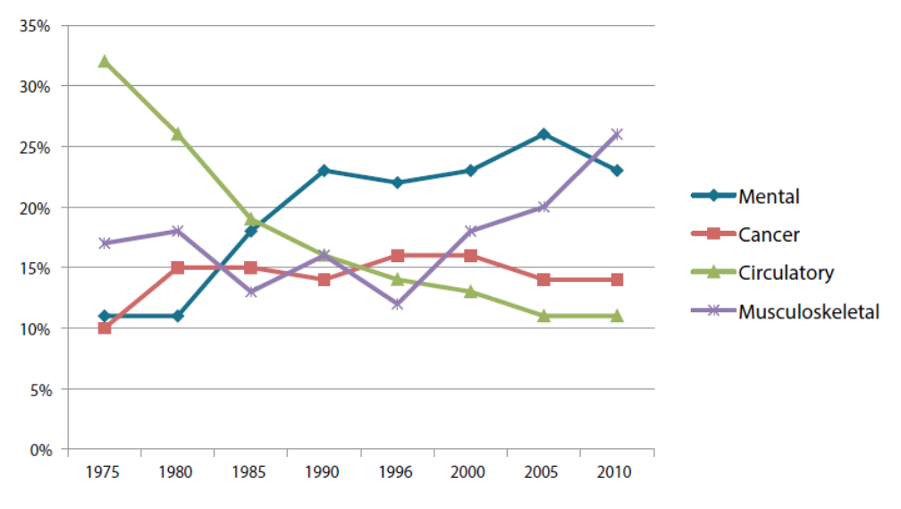
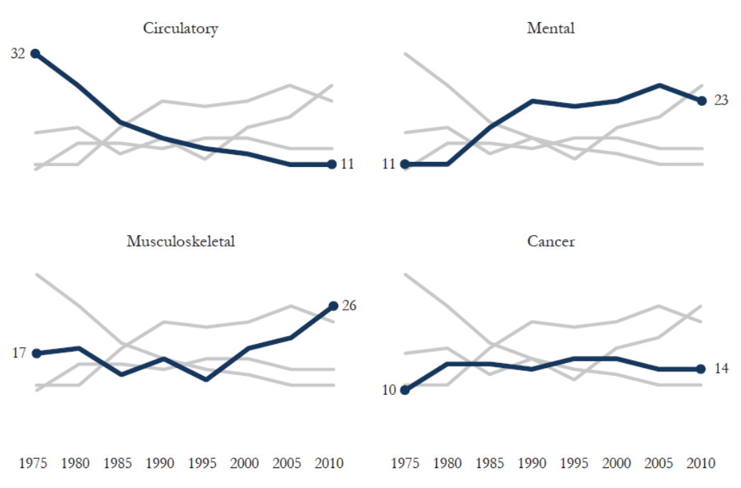
Chart Rethinking: Exercise 7
Schwabish, J. A. (2014). An Economist’s Guide to Visualizing Data
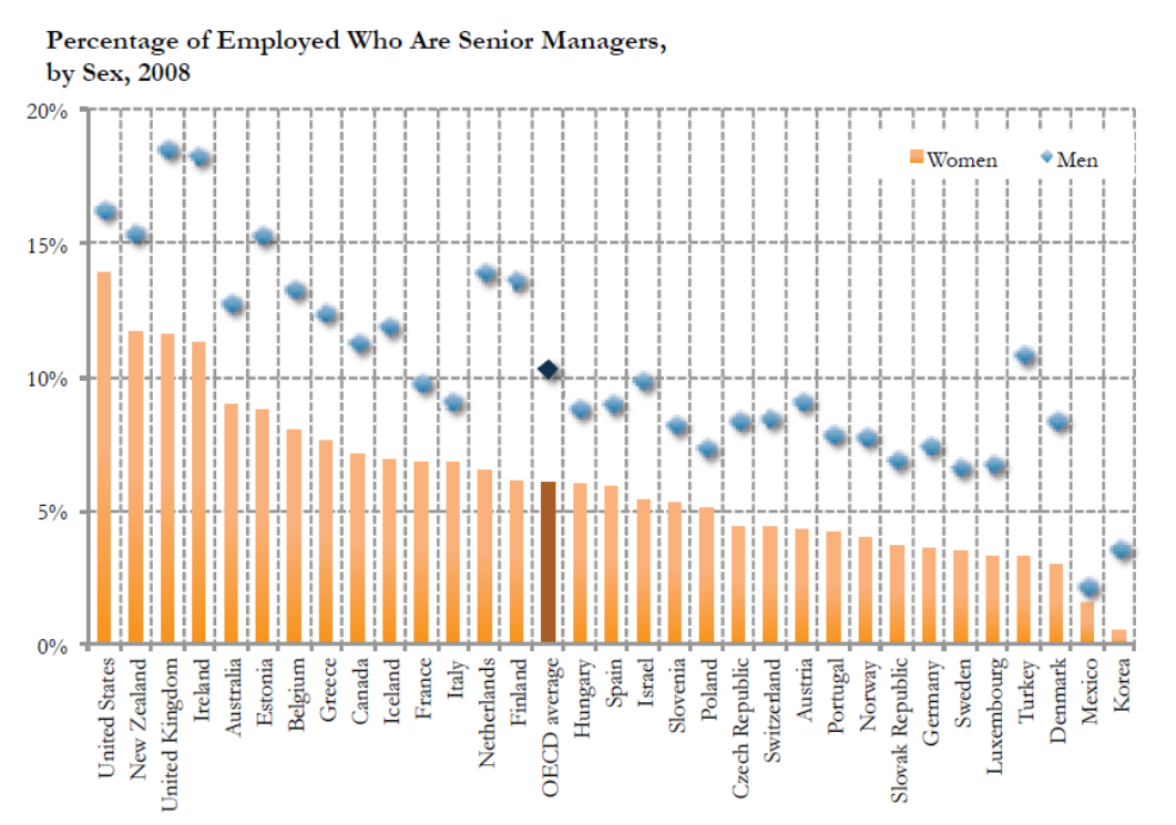
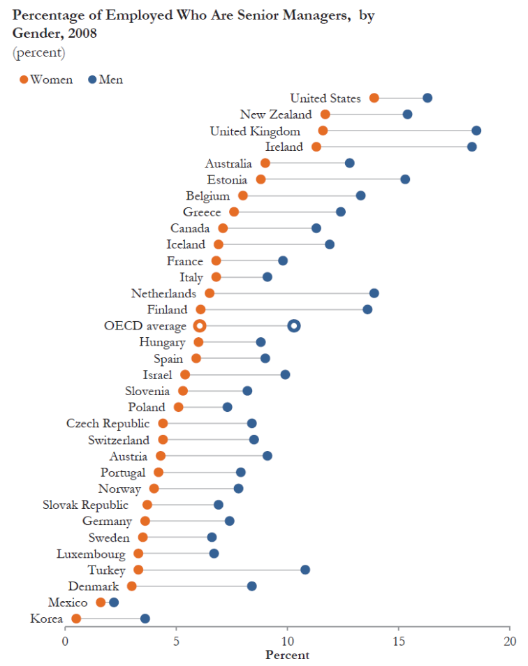
Chart Rethinking: Exercise 8
Schwabish, J. A. (2014). An Economist’s Guide to Visualizing Data